
A scatter chart — also called an XY chart or scatter plot — plots each data point by two values, one on each axis, to reveal the relationship or correlation between two variables. Ampler Charts builds scatter charts natively in PowerPoint; add a size dimension to turn one into a bubble chart.
Quick answer: Click Ampler Charts and select X Y (Scatter), drag the chart to size, then enter your data — each point is placed by its X and Y values.
How to create it
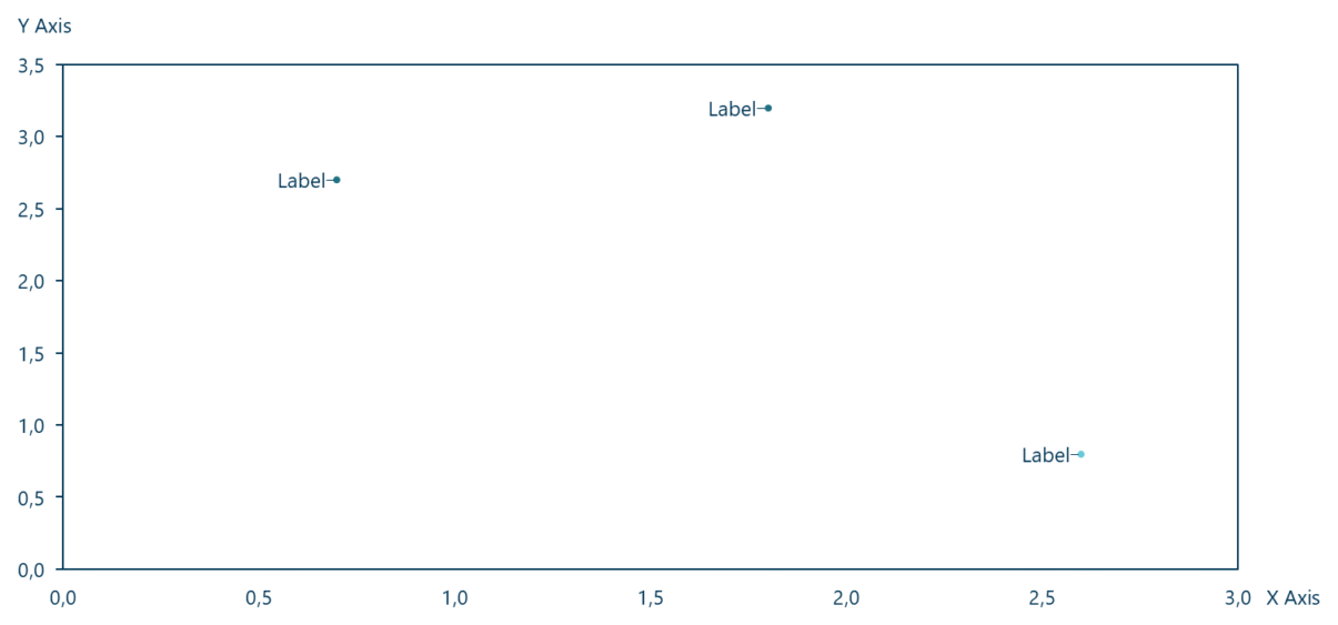
A scatter chart plots each point by its X and Y values to reveal the relationship between two variables.
- Click Ampler Charts in the ribbon and select X Y (Scatter) from the chart menu.
- Left-click and drag the chart to the size you want — or hold Ctrl to place it in a pre-defined position.
- Enter your data in the data sheet: each point has an X value and a Y value that place it on the two axes.
When to use it
Use a scatter chart to show the relationship between two numeric variables — whether they correlate, how tightly, and where the outliers sit — across many points. If a meaningful third variable matters (size, revenue, market share), use a bubble chart; if you are tracking one measure over time, use a line chart.
How consultants use it
Consultants use the scatter as a diagnostic and a decision map. A few practices apply:
- Read the pattern first: the shape of the cloud tells the story — positive, negative or no correlation, plus the outliers that break the pattern
- Turn it into a 2×2: splitting the plot into quadrants makes a scatter a decision map — the classic prioritisation or positioning matrix
- Label what matters, not everything: call out the handful of points that carry the argument rather than every dot
A scatter chart turns two variables into a picture of how they relate — and, with quadrants, into a decision.
Tips & best practices
- Split the plot into quadrants (a 2×2) to turn it into a positioning or prioritisation map.
- Label or highlight only the outliers and the points that carry the message.
- Add bubble size only when a third variable is meaningful — then it becomes a bubble chart.
What you can add to this chart
Decorators and elements you can layer onto a scatter chart in Ampler Charts:
- Add a trendline
- Add reference lines
- Add a 2×2 or 3×3 matrix
- Add an ROS/RMS band
- Add value, text and size labels
Availability
Part of Ampler Charts, included in Ampler for PowerPoint and the Ampler Suite, on Windows desktop PowerPoint.
Frequently asked questions
What is a scatter chart?
A scatter chart — or XY chart / scatter plot — plots each point by two numeric values, one on each axis, to show the relationship or correlation between the two variables.
How do you make a scatter plot in PowerPoint?
In Ampler Charts, click Ampler Charts, select X Y (Scatter), drag it to size, then enter an X and a Y value for each point.
What’s the difference between a scatter and a bubble chart?
A scatter chart shows two variables (X and Y); a bubble chart adds a third, shown as the size of each point.
When should you use a scatter chart?
When you want to show how two numeric variables relate — correlation, distribution, outliers — or to build a 2×2 positioning matrix.