
A combination chart plots two chart types together — typically columns and a line — often on two Y-axes, so you can show a volume alongside a rate: revenue with margin %, units with a growth rate. Ampler Charts builds it natively in PowerPoint and lets you add a second Y-axis for the two different scales.
Quick answer: Click Ampler Charts and select Combination, drag the chart to size, then enter your data — set which series are columns and which is a line, and add a second Y-axis for the second scale.
How to create it
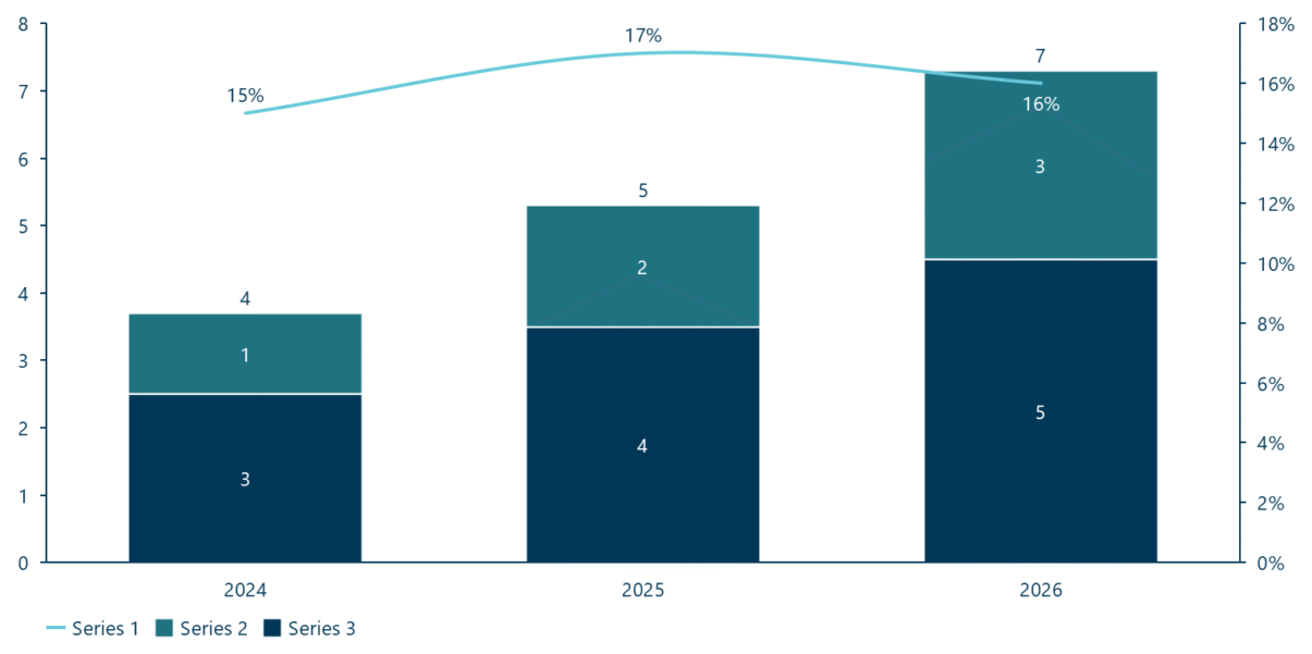
A combination chart: columns for volume and a line for a rate, on two Y-axes.
- Click Ampler Charts in the ribbon and select Combination from the chart menu.
- Left-click and drag the chart to the size you want — or hold Ctrl to place it in a pre-defined position.
- Enter your data in the data sheet, with each series set to a column or a line.
Add a second Y-axis when the two series use different scales — for example a volume and a percentage.
When to use it
Use a combination chart when you are showing two related measures with different units or ranges — a volume (columns) against a rate or percentage (line). Keep it to two chart types and a few series. Take care with the second axis: it can mislead if the scales are not honest — the combo earns its place only when the relationship genuinely matters.
How consultants use it
The combination chart is powerful and easily abused, so consultants use it deliberately. A few practices apply:
- Columns for volume, a line for the rate: show discrete totals or counts as columns and a continuous rate or percentage as a line, each on its own axis
- Scale both axes honestly: a dual axis can make a small change look dramatic — set the ranges so the visual correlation is fair, not manufactured
- Keep it to two types and a few series: two chart types and three or four series over a handful of periods; more than that and it clutters
A combination chart pairs a volume and a rate in one view — valuable when the relationship is real and the axes are honest.
Tips & best practices
- Use columns for the volume and a line for the rate, and add a second Y-axis only for genuinely different scales.
- Scale both axes honestly so the comparison isn’t misleading — this is the most-misused chart in a deck.
- Keep to two chart types and three or four series over a handful of periods.
What you can add to this chart
Decorators and elements you can layer onto a combination chart in Ampler Charts:
- Add CAGR arrows
- Add total and level differences
- Add, position and format a value line
- Add connectors between series
- Add series shares
Availability
Part of Ampler Charts, included in Ampler for PowerPoint and the Ampler Suite, on Windows desktop PowerPoint.
Frequently asked questions
What is a combination chart?
A combination chart plots two chart types together — usually columns and a line — often on two Y-axes, so a volume and a rate can be shown in one view.
How do you make a combination chart in PowerPoint?
In Ampler Charts, click Ampler Charts, select Combination, drag it to size, enter your data, and add a second Y-axis for the series that uses a different scale.
When should you use a dual-axis chart?
When two related measures have different units or ranges — such as revenue and margin % — and the relationship between them genuinely matters; scale both axes honestly.
What’s the difference between a combination chart and two separate charts?
A combination chart overlays a volume and a rate so their relationship is read at once; two separate charts keep the scales independent but make the reader compare across charts.