
Ampler Charts can label the points of a bubble chart directly — with their value (the x and y position), a text name, and their size — so the reader doesn’t have to hop to a legend. It works on bubble and scatter charts.
Quick answer: Right-click the chart and toggle on Value labels, then toggle on Text labels and Size labels for the rest — so every point states its position, name and size.
How to add it
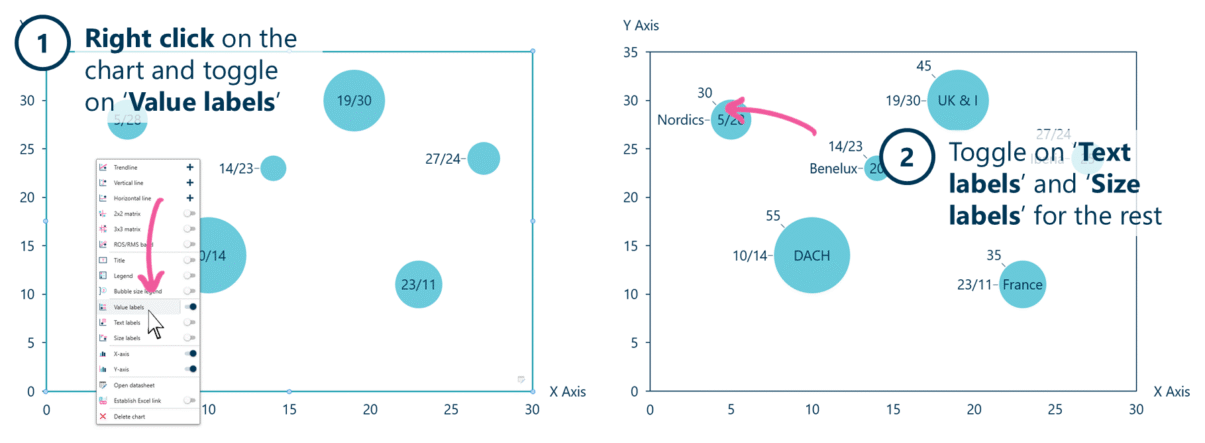
Toggle on Value labels, then Text and Size labels, to label every point directly.
- Right-click on the bubble chart and toggle on Value labels — each point shows its x and y value.
- Toggle on Text labels and Size labels for the rest — the point’s name and its size.
When to use it
Direct labelling beats a legend: value labels give each point’s x/y position, text labels name the entity, and size labels state the third variable. Turn them on when you want every point to explain itself, so the reader isn’t matching colours to a key.
How consultants use it
A fully labelled scatter or bubble chart is a finished exhibit — nothing to look up. A few practices apply:
- Label directly, don’t make the reader look up: text labels name the markets or competitors at the point itself, so the eye never leaves the chart for a legend
- Use the three label types for the three variables: value for position, text for the name, size for the magnitude — together they make every point self-contained
- Label what matters, not everything: on a crowded chart, label the points that carry the argument and leave the rest, to avoid a tangle of overlapping text
Once the points are labelled you can drop the legend — the chart says everything at the point.
Tips & best practices
- Text labels for names, value labels for position, size labels for the third variable.
- Turn the legend off once points are labelled directly — the labels replace it.
- On a crowded chart, label only the points that matter to avoid overlap.
Availability
Part of Ampler Charts, included in Ampler for PowerPoint and the Ampler Suite, on Windows desktop PowerPoint.
Frequently asked questions
How do you label points on a scatter or bubble chart in PowerPoint?
In Ampler Charts, right-click the chart and toggle on Value labels, then Text labels and Size labels — each point can show its position, name and size directly.
What’s the difference between value, text and size labels?
Value labels show a point’s x and y position; text labels show its name; size labels show the value behind the bubble’s size. Together they make each point self-explaining.
Can I label a scatter chart the same way?
Yes — value and text labels work on scatter charts too; size labels apply where the points carry a size (bubble charts).
How do I remove the legend after labelling the points?
Once points carry text labels you can toggle the legend off from the same right-click menu — the direct labels replace it.