
Ampler Charts can add vertical and horizontal reference lines to a scatter chart — movable lines that mark a target, an average or a threshold, and split the plot into regions. They work on scatter and bubble charts; a pair of them at the medians is the basis of a 2×2 matrix.
Quick answer: Right-click the plot area and select Vertical line, then right-click again for a Horizontal line, and drag each into position — to mark a benchmark, a target or a median on the chart.
How to add it
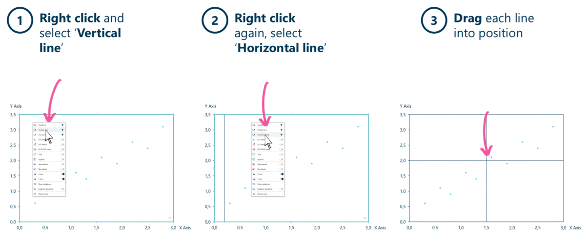
Add a vertical line, then a horizontal line, and drag each into position to mark a threshold.
- Right-click in the plot area and select Vertical line.
- Right-click again and select Horizontal line.
- Drag each line into position — to a target, an average or a median.
When to use it
Add a reference line when a number on the chart carries meaning — a target margin, the market average, last year’s level, a break-even point. The line gives every point a benchmark to be read against, and a crossing pair divides the scatter into regions you can name.
How consultants use it
Reference lines are how a consultant turns a scatter into a judgement. A few practices apply:
- Anchor to a number that means something: a target, an average, a median, a break-even — not an arbitrary round figure; the line is only as useful as the threshold it marks
- A crossing pair makes quadrants: a vertical and a horizontal line at the medians split the plot into four regions — the start of a 2×2 without the full matrix overlay
- Label the line with its value: the reader shouldn’t have to guess what “the line” is; put the number and what it represents next to it
One line sets a benchmark; two crossing lines start a decision map — both from a right-click.
Tips & best practices
- Use the median for an even four-way split; use a target when the point is performance against plan.
- Two crossing lines are the quickest route to a quadrant read — step up to the 2×2 matrix when you want the labelled grid.
- Label each line so its meaning stands without explanation.
Availability
Part of Ampler Charts, included in Ampler for PowerPoint and the Ampler Suite, on Windows desktop PowerPoint.
Frequently asked questions
How do you add a benchmark or reference line to a chart in PowerPoint?
In Ampler Charts, right-click a scatter chart’s plot area and select Vertical line or Horizontal line, then drag it to the value you want to mark — a target, an average or a threshold.
What’s the difference between a vertical and a horizontal reference line?
A vertical line marks a value on the x-axis (for example a market-share threshold); a horizontal line marks a value on the y-axis (for example a target margin). You can add both and drag each into position.
How is a reference line different from a trendline?
A reference line marks a fixed benchmark you choose (a target or average); a trendline is a best-fit line calculated from the data. One sets a threshold, the other summarises the relationship.
Can I make a quadrant chart with reference lines?
Yes — a crossing vertical and horizontal line split the plot into four regions. For a labelled grid with a finer option, use the 2×2 or 3×3 matrix overlay instead.