
A line chart connects data points with a line to show a trend over a continuous scale, usually time — the clearest way to show how one or more measures move over months, quarters or years. Ampler Charts builds line charts natively in PowerPoint, with optional markers on the points and smooth (spline) interpolation, and lets you combine lines with columns in a combination chart.
Quick answer: Click Ampler Charts and select Line, drag the chart to size, then enter your data — each series becomes a line across the categories.
How to create it
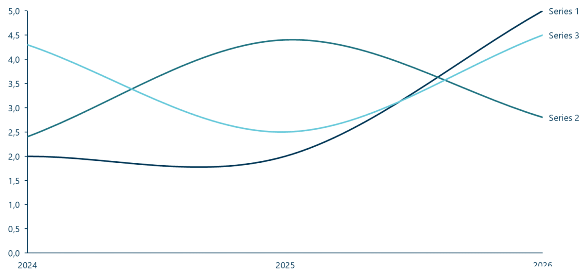
A line chart connects points to show a trend over a continuous scale.
- Click Ampler Charts in the ribbon and select Line from the chart menu.
- Left-click and drag the chart to the size you want — or hold Ctrl to place it in a pre-defined position.
- Enter your data in the data sheet: each series becomes a line across the categories on the X-axis.
You can add markers to the data points, or switch to smooth (spline) lines, from the chart’s format options.
When to use it
Use a line chart to show trends over time or another continuous scale — especially longer-term movements, and when there are many data points that would clutter a column chart. Keep the number of lines low to avoid a tangled ‘spaghetti chart’. For a discrete category comparison, a stacked column or clustered column reads better; to mix a trend with volumes, use a combination chart.
How consultants use it
The line chart is the deck’s standard for trends. A few practices apply:
- Use it for continuous trends: lines suit time series and continuous data, especially long-term movements — where individual columns would clutter
- Avoid the spaghetti chart: keep to a few lines; too many overlapping series become unreadable
- Label the lines directly: put each series name at the end of its line (as in the example) rather than making the reader chase a legend
A line chart shows where the numbers are heading — kept clean, it’s the fastest read of a trend.
Tips & best practices
- Label each line at its end rather than relying on a separate legend.
- Keep to a few series to avoid an unreadable ‘spaghetti’ chart.
- Add markers when the points are few; use a smooth (spline) line for a trend, a straight line for exact values.
What you can add to this chart
Decorators and elements you can layer onto a line chart in Ampler Charts:
Availability
Part of Ampler Charts, included in Ampler for PowerPoint and the Ampler Suite, on Windows desktop PowerPoint.
Frequently asked questions
What is a line chart?
A line chart connects data points with a line to show how a measure changes over a continuous scale — usually time — making trends easy to read.
How do you make a line chart in PowerPoint?
In Ampler Charts, click Ampler Charts, select Line, drag it to size, then enter your data — each series becomes a line, with optional markers or smooth (spline) interpolation.
What’s the difference between a line chart and a column chart?
A line chart shows a continuous trend over time and handles many data points; a column chart emphasises the individual values of a few discrete categories.
How many lines should a line chart have?
Keep it to a few — too many overlapping lines create a tangled ‘spaghetti chart’ that is hard to read.