
Ampler Charts can add an ROS/RMS band to a scatter chart — the diagonal corridor used in the classic profitability-versus-market-share exhibit, plotting Return on Sales against relative market share. It works on scatter and bubble charts, where the band shows the profitability you’d expect for a given share and which businesses beat it.
Quick answer: Right-click the plot area and toggle on ROS/RMS band — a shaded band is drawn around the trend of the points, marking the expected Return-on-Sales corridor for each level of relative market share.
How to add it
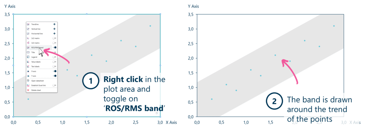
Toggle on ROS/RMS band to shade the expected-profitability corridor around the points.
- Right-click in the plot area of the scatter chart and toggle on ROS/RMS band.
- The band is drawn around the trend of the points, showing the expected corridor.
When to use it
Use the ROS/RMS band for the profitability–versus–share analysis: Return on Sales on the y-axis, relative market share on the x-axis, and a band showing the profitability a business ought to earn at that share. The point of the exhibit is who sits above the band (earning more than their share predicts) and who sits below.
How consultants use it
The ROS/RMS chart is a strategy-classic, tied to the experience curve and relative market share. A few practices apply:
- Put relative market share on a log axis: market share spans orders of magnitude across competitors; a log x-axis is the convention that makes the corridor read straight
- Read the residuals, not the average: the finding is the businesses off the band — an over-performer earning above its share, or an under-performer leaving margin on the table
- Size the bubbles by revenue: on a bubble chart, size each point by sales so a small over-performer isn’t mistaken for a large one
The band sets the expectation; the businesses that break from it are the argument.
Tips & best practices
- Label the notable over- and under-performers — they are the reason for the chart.
- Use relative market share (versus the largest competitor), not absolute share, on the x-axis.
- Pair it with a bubble chart so revenue size and profitability read together.
Availability
Part of Ampler Charts, included in Ampler for PowerPoint and the Ampler Suite, on Windows desktop PowerPoint.
Frequently asked questions
What is an ROS/RMS chart?
An ROS/RMS chart plots Return on Sales (profitability) on the y-axis against relative market share on the x-axis, with a band showing the profitability expected at each level of share. It’s a classic strategy exhibit for spotting over- and under-performers.
How do you add an ROS/RMS band in PowerPoint?
In Ampler Charts, right-click the scatter chart’s plot area and toggle on ROS/RMS band — a shaded corridor is drawn around the trend of the points.
What does the ROS/RMS band mean?
The band marks the Return on Sales you’d expect for a given relative market share. Businesses above the band are more profitable than their share predicts; those below are less profitable than expected.
How is the ROS/RMS chart related to the growth–share matrix?
Both use relative market share, from BCG’s work on the experience curve. The growth–share matrix positions units on growth versus share; the ROS/RMS chart plots profitability versus share and bands the expected relationship.