
A doughnut chart is a pie chart with a hole in the middle — the same part-to-whole slices, but the centre frees space for a headline figure such as a total or a KPI. Ampler Charts builds it natively in PowerPoint; without the central figure, a pie chart does the same job. (Also spelled “donut chart”.)
Quick answer: Click Ampler Charts and select Doughnut, drag the chart to size, then enter your data — each value becomes a segment of the ring, and the centre is free for a label.
How to create it
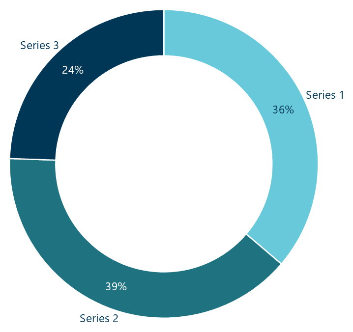
A doughnut chart: a pie with a central hole for a headline figure.
- Click Ampler Charts in the ribbon and select Doughnut from the chart menu.
- Left-click and drag the chart to the size you want — or hold Ctrl to place it in a pre-defined position.
- Enter your data in the data sheet: each value becomes a segment of the ring, with the centre free for a headline figure.
When to use it
Use a doughnut when you want a part-to-whole split and a headline number in the centre — ‘Total revenue’, ‘100% of cost base’ — with a small number of segments (about two to four). With more categories, a pie or a bar is clearer; without a central figure, a pie is simpler.
How consultants use it
The doughnut earns its place when the centre carries a number. A few practices apply:
- Use the centre: put a total or a single KPI in the hole — that headline figure is the doughnut’s advantage over a pie
- Keep the segments few: about two to four segments; with more, a pie or bar reads better
- Label directly, highlight one: name and value on each segment, with a stronger colour on the one that carries the message
A doughnut is a pie that earns a headline number in its centre — best kept to a few segments.
Tips & best practices
- Put a total or KPI in the centre — that is the reason to choose a doughnut over a pie.
- Keep to about two to four segments and label them directly.
- For more categories, use a pie or a bar chart instead.
Availability
Part of Ampler Charts, included in Ampler for PowerPoint and the Ampler Suite, on Windows desktop PowerPoint.
Frequently asked questions
What is a doughnut chart?
A doughnut chart — also spelled donut chart — is a pie chart with a hole in the centre, showing parts of a whole as ring segments while the centre is free for a headline figure.
How do you make a doughnut chart in PowerPoint?
In Ampler Charts, click Ampler Charts, select Doughnut, drag it to size, then enter your data — each value becomes a ring segment.
What’s the difference between a doughnut and a pie chart?
A doughnut is a pie with a central hole, which gives you space for a total or KPI in the middle; otherwise they show the same part-to-whole split.
When should you use a doughnut chart?
When you want a part-to-whole split with a small number of segments and a headline figure — a total or KPI — in the centre.