
Ampler Charts can overlay a 2×2 or 3×3 matrix on a scatter chart, turning a plot of two variables into the classic consulting positioning map — a prioritisation grid, a growth–share matrix, an effort–impact 2×2. It works on scatter and bubble charts, natively in PowerPoint.
Quick answer: Right-click the scatter chart’s plot area and toggle on 2×2 matrix (or 3×3 matrix for a finer nine-box grid); quadrant lines are drawn across the points, which you can label as a decision map.
How to add it
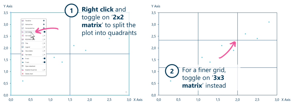
Toggle on 2×2 matrix to split the scatter into quadrants, or 3×3 for a nine-box grid.
- Right-click the main plot area of the scatter chart and toggle on 2×2 matrix — the plot is split into four quadrants.
- For a finer grid, toggle on 3×3 matrix instead — a nine-box (3×3) grid is shown.
Drag the dividing lines to set the thresholds, and label the quadrants with text boxes.
When to use it
Use a 2×2 when you’re positioning items on two criteria and the message is which quadrant each falls into — prioritise (effort vs impact), position (growth vs share), screen (attractiveness vs fit). Step up to the 3×3 (nine-box) when a middle tier matters and a plain high/low split is too blunt.
How consultants use it
The 2×2 is the consultant’s signature framework — MECE quadrants on two axes, from the BCG growth–share matrix to a simple effort–impact grid. A few practices apply:
- Pick two axes that force a decision: the power is that each quadrant implies an action — invest, hold, harvest, divest (BCG); do-now, plan, delegate, drop (prioritisation)
- Keep it MECE and sparse: two clean criteria and a handful of labelled points; the matrix loses its edge when it is crowded or the axes overlap
- Use 3×3 only when the middle earns it: the GE / McKinsey nine-box adds a medium tier — worth it when high/low hides the real choices, overkill when it doesn’t
A 2×2 turns two variables into a decision map — which is exactly why it is the most-reached-for chart in a strategy deck.
Tips & best practices
- Label all four quadrants (or nine cells) so the reader doesn’t have to infer them.
- Drag the dividing lines to meaningful thresholds, not just the midpoint.
- Add bubble size for a third dimension — a growth–share matrix on a bubble chart with revenue as the bubble.
Availability
Part of Ampler Charts, included in Ampler for PowerPoint and the Ampler Suite, on Windows desktop PowerPoint.
Frequently asked questions
How do you make a 2×2 matrix in PowerPoint?
In Ampler Charts, right-click a scatter chart’s plot area and toggle on 2×2 matrix — the plot splits into four quadrants you can label. Toggle 3×3 matrix for a nine-box grid.
What is a 2×2 matrix?
A 2×2 matrix positions items in four quadrants defined by two criteria (each high or low), so each quadrant implies an action — the basis of frameworks like the BCG growth–share matrix and effort–impact prioritisation.
Can you build a BCG growth–share or GE nine-box matrix in Ampler Charts?
Yes — a scatter or bubble chart with the 2×2 matrix overlay gives a growth–share matrix (add bubble size for revenue); the 3×3 matrix overlay gives the GE / McKinsey nine-box.
What’s the difference between a 2×2 and a 3×3 matrix?
A 2×2 splits each axis into high/low (four quadrants); a 3×3 adds a middle tier on each axis (nine cells) for a more nuanced view — the GE / McKinsey nine-box.