
A waterfall chart — also called a bridge chart — shows how a starting value changes through a sequence of increases and decreases to reach a final total. In the build-up form, intermediate values add and subtract from an opening value in the first column to a closing total — the standard way to draw a revenue bridge, an EBITDA bridge or a P&L movement. Ampler Charts builds it natively in PowerPoint; the mirror form is a waterfall build-down.
Quick answer: Click Ampler Charts and select Waterfall build-up, drag the chart to size, then enter your data — an opening value in the first column, then the increases and decreases that build to the closing total.
How to create it
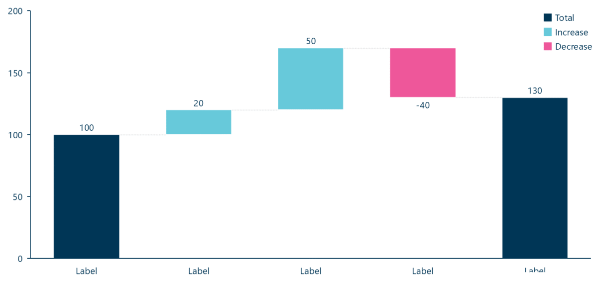
A waterfall (bridge) chart: an opening value builds up through increases and decreases to a total.
- Click Ampler Charts in the ribbon and select Waterfall build-up from the chart menu.
- Left-click and drag the chart to the size you want — or hold Ctrl to place it in a pre-defined position.
- Enter your data in the data sheet: the first column is the opening value, and the intermediate columns add and subtract to reach the closing total.
Type a t in the data sheet to add an automatic subtotal at any point — see controlling Waterfall subtotals.
When to use it
Use a waterfall when you need to explain a change from one figure to another as a sequence of drivers — a revenue bridge, an EBITDA or cost bridge, a headcount reconciliation. Use the build-up when you are adding up from an opening value to a total; use the build-down when you are breaking a total down.
How consultants use it
A waterfall — a ‘bridge’ to bankers and consultants — is an argument in chart form, and the order of the steps is the argument. A few practices apply:
- Sequence the story logically: order the steps so the bridge reads like arithmetic, not detective work — a clean build where each column follows from the one before
- Group related drivers, largest first: group related movements and put the biggest contributors where they can’t be missed, so the reconciliation lands
- Get the subtotals right: use a ‘t’ column for automatic subtotals so they recompute with the data and the bridge always adds up
A waterfall turns a movement between two figures into a clear, ordered story of what drove it.
Tips & best practices
- Order the columns to tell the story: opening value, drivers, closing total.
- Use a t column for automatic subtotals rather than hand-typed figures — see Waterfall subtotals.
- Colour increases and decreases distinctly, and reorder the categories to sequence the drivers.
What you can add to this chart
Decorators and elements you can layer onto a waterfall chart in Ampler Charts:
Availability
Part of Ampler Charts, included in Ampler for PowerPoint and the Ampler Suite, on Windows desktop PowerPoint.
Frequently asked questions
What is a waterfall chart?
A waterfall chart — or bridge chart — shows how a starting value changes through a sequence of increases and decreases to reach a final total, so a movement between two figures is broken into its drivers.
How do you make a waterfall chart in PowerPoint?
In Ampler Charts, click Ampler Charts, select Waterfall build-up, drag it to size, then enter an opening value and the increases and decreases that build to the total.
What’s the difference between a build-up and a build-down waterfall?
A build-up adds intermediate values up from an opening value to a total; a build-down deducts intermediate values from a starting total down to a remainder.
When should you use a waterfall chart?
When you need to explain a change from one figure to another as a sequence of drivers — a revenue, EBITDA, cost or headcount bridge.