
Ampler Charts can fit a trendline through the points of a scatter chart, drawing the underlying relationship between your two variables as a single best-fit line. It works on scatter and bubble charts, natively in PowerPoint — and pairs with reference lines and the 2×2 matrix as ways to read a scatter.
Quick answer: Right-click the scatter chart’s plot area and select Trendline — a best-fit line is drawn across all the data points so the direction and strength of the relationship read at a glance.
How to add it
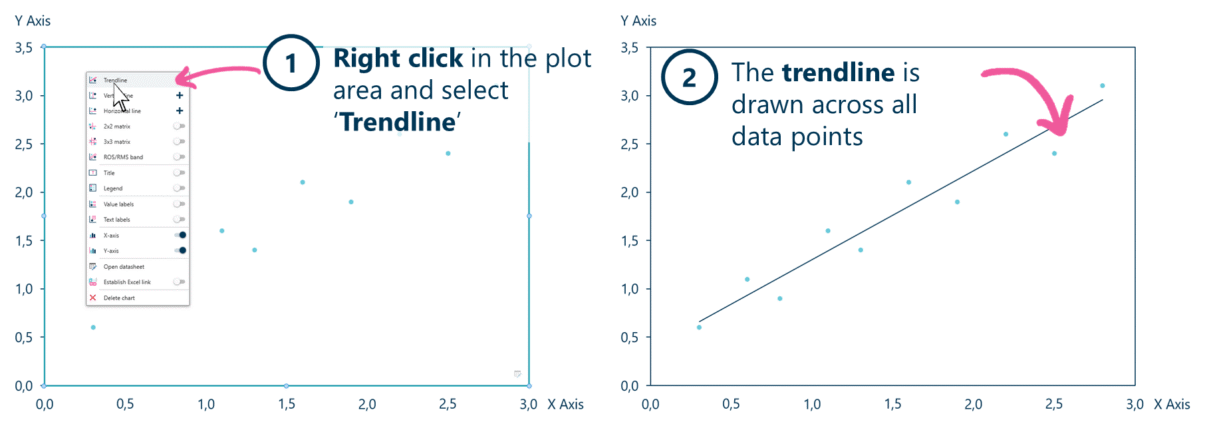
Right-click the plot area and select Trendline to fit a best-fit line across the points.
- Right-click in the plot area of the scatter chart and select Trendline.
- The trendline is drawn across all the data points, showing the best fit.
When to use it
Add a trendline when the message is the relationship between two variables — whether they move together, how steeply, and which points sit off the pattern. The line turns a cloud of dots into a readable direction, and the points that fall furthest from it are exactly the ones worth a callout.
How consultants use it
A trendline is how a consultant makes a scatter argue a point rather than just display data. A few practices apply:
- Read the slope, not just the direction: a steeper line means a stronger effect — say what a one-unit move on the x-axis does to the y
- Treat the outliers as the finding: the points furthest above or below the line are the over- and under-performers; label them, they are usually the story
- Show the fit, don’t oversell it: a trendline shows correlation, not causation — keep the claim to “associated with” unless you have more than a chart
A fitted line plus a couple of labelled outliers is often the whole slide — the pattern, and the exceptions to it.
Tips & best practices
- Keep the individual points visible — the trendline supports them, it doesn’t replace them.
- Label the two or three points that sit furthest from the line.
- On a bubble chart, a trendline reads the relationship while bubble size carries a third variable.
Availability
Part of Ampler Charts, included in Ampler for PowerPoint and the Ampler Suite, on Windows desktop PowerPoint.
Frequently asked questions
How do you add a trendline to a scatter chart in PowerPoint?
In Ampler Charts, right-click the scatter chart’s plot area and select Trendline — a best-fit line is drawn across all the data points. It works the same on a bubble chart.
What does a trendline show?
A trendline shows the overall relationship between the two plotted variables — its direction (do they rise or fall together) and steepness (how strong the effect is). Points far from the line are outliers worth examining.
Is a trendline the same as a line of best fit?
Yes — a trendline is a line of best fit drawn through a scatter of points to summarise their overall relationship.
Can I add a trendline to a bubble chart?
Yes — the trendline works on both scatter and bubble charts, so you can read the relationship between the x and y variables while bubble size carries a third dimension.