
A clustered column chart places columns side by side within each category so you can compare values directly — this year versus last, actual versus budget, one series against another across categories. Ampler Charts builds it natively in PowerPoint; where the total of the series matters more than the side-by-side comparison, use a stacked column instead.
Quick answer: Click Ampler Charts and select Clustered Column, drag the chart to size, then enter your data — each series is drawn as its own column side by side within the category.
How to create it
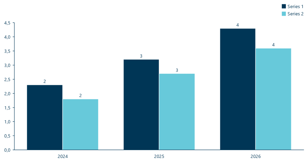
A clustered column chart: series shown side by side for direct comparison.
- Click Ampler Charts in the ribbon and select Clustered Column from the chart menu.
- Left-click and drag the chart to the size you want — or hold Ctrl to place it in a pre-defined position.
- Enter your data in the data sheet: each series is drawn as its own column, side by side within each category.
When to use it
Use a clustered column to compare individual values side by side across categories — actual versus plan, region versus region, this year versus last. If the total of the series matters more than the individual comparison, a stacked column is better — and you can combine both, a stacked-clustered chart, using a category gap.
How consultants use it
The clustered column is the consultant’s tool for a direct like-for-like comparison. A few practices apply:
- Compare like with like: side-by-side columns answer ‘which is bigger’ at a glance — actual versus budget, or two years against each other
- Keep the clusters small: two to four columns per category stays readable; more than that and the groups blur together
- Colour by series, consistently: give each series one colour across every cluster so the comparison reads without re-checking a legend
A clustered column answers ‘which is bigger’ — use it when the comparison, not the total, is the point.
Tips & best practices
- Keep to two to four series per cluster so the groups stay readable.
- Give each series a consistent colour across all clusters.
- Combine comparison and total with a stacked-clustered chart via a category gap.
What you can add to this chart
Decorators and elements you can layer onto a clustered column chart in Ampler Charts:
Availability
Part of Ampler Charts, included in Ampler for PowerPoint and the Ampler Suite, on Windows desktop PowerPoint.
Frequently asked questions
What is a clustered column chart?
A clustered column chart — also called a grouped column chart — places each series as its own column side by side within a category, so you compare their individual values directly.
How do you make a clustered column chart in PowerPoint?
In Ampler Charts, click Ampler Charts, select Clustered Column, drag it to size, then enter your data — each series is drawn as a side-by-side column.
What’s the difference between a clustered and a stacked column chart?
A clustered column compares series side by side (which is bigger); a stacked column stacks them into one column to show the total and its composition.
How many series should a clustered column chart have?
Keep it to about two to four columns per category — beyond that the clusters get hard to read, and a different chart usually works better.