
A Gantt chart lays a project’s activities out against a timeline as horizontal bars, so a workplan’s tasks, durations, milestones and owners are visible at a glance. Ampler Charts builds Gantt charts natively in PowerPoint and edits them entirely from the data sheet, where each row is an activity.
Quick answer: Click Ampler Charts and select Gantt, drag the chart to size, then enter the plan in the data sheet — each row is an activity with its dates, type and owner.
How to create it
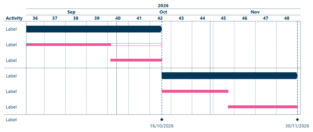
A Gantt chart: project activities as horizontal bars along a timeline, with milestones.
- Click Ampler Charts in the ribbon and select Gantt from the chart menu.
- Left-click and drag the chart to the size you want — or hold Ctrl to place it in a pre-defined position.
- Open the data sheet and enter each activity as a row — its start and end dates, activity type, and owner; the Gantt updates as you edit.
The Gantt is edited entirely from the data sheet, where each row is an activity.
When to use it
Use a Gantt to show a project plan or timeline — the sequence, durations and dependencies of activities, with milestones and owners. It is the standard way to present a workplan to a steering committee.
How consultants use it
A project timeline is a core consulting deliverable, and the Gantt is how it is presented. A few practices apply:
- Build it as data: enter the plan in the data sheet, one activity per row, so it stays maintainable and updates as the project moves
- Make it accountable: add Responsible and Comment columns so every activity has an owner — a workplan, not just a timeline
- Structure the phases: use milestones, brackets and shading to group activities into phases, and Harvey balls or checkboxes to show status
A Gantt turns a plan into a picture a steering committee can read — maintainable because it is built as data.
Tips & best practices
- Build and edit the Gantt from the data sheet, one activity per row.
- Add Responsible and Comment columns to make the plan accountable, and show status with Harvey balls or checkboxes.
- Format the Gantt — date range, scales and language — to fit its audience.
Availability
Part of Ampler Charts, included in Ampler for PowerPoint and the Ampler Suite, on Windows desktop PowerPoint.
Frequently asked questions
What is a Gantt chart?
A Gantt chart lays a project’s activities out against a timeline as horizontal bars, showing their durations, sequence, milestones and owners at a glance.
How do you make a Gantt chart in PowerPoint?
In Ampler Charts, click Ampler Charts, select Gantt, drag it to size, then enter each activity as a row in the data sheet — its dates, type and owner.
How do you edit a Gantt chart?
Edit it from the data sheet, where each row is an activity; changing the dates, type or owner of a row updates the Gantt automatically.
When should you use a Gantt chart?
When you need to present a project plan or timeline — the sequence, durations and dependencies of activities, with milestones and owners — typically to a steering committee.