
A 100% stacked area chart shows how composition shifts over time — each period is scaled to 100% so the bands read as shares of the total. It is the share-focused form of the stacked area; where category size also matters, a Mekko may fit better. Ampler Charts builds it natively in PowerPoint.
Quick answer: Click Ampler Charts and select 100% Stacked Area, drag the chart to size, then enter your data — each period is scaled to 100% so the bands show each series as a share over time.
How to create it
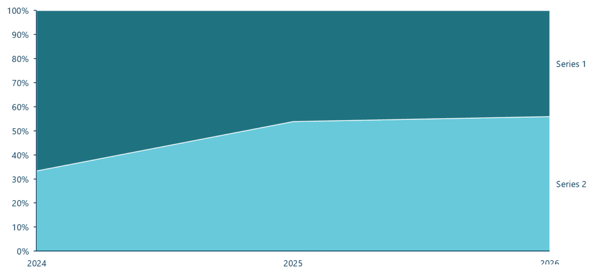
A 100% stacked area chart: each period scaled to 100% so the bands show shares over time.
- Click Ampler Charts in the ribbon and select 100% Stacked Area from the chart menu.
- Left-click and drag the chart to the size you want — or hold Ctrl to place it in a pre-defined position.
- Enter your data in the data sheet: each period is normalised to 100%, so the bands show each series’ share of the total over time.
When to use it
Use a 100% stacked area to show how a mix shifts over time — market share by segment over years, cost mix over quarters — when the shares matter more than the totals. If the total trend matters too, use a stacked area; for discrete periods that need precise reading, a 100% stacked column is clearer.
How consultants use it
For a shifting-mix-over-time story, the 100% stacked area is the tool. A few practices apply:
- Base the key series: place the series you care about most at the bottom so its share is read against the axis, not a moving baseline
- Keep the bands few: two to five shares read cleanly; group the long tail into an ‘Other’
- Label the ends: name each band at the right edge so the reader isn’t chasing a legend across a moving chart
A 100% stacked area shows a mix changing over time — ideal when share, not size, is the point.
Tips & best practices
- Put the key series at the base so its share reads against the axis.
- Keep to a few bands and label them at the right edge.
- Use a 100% stacked column when discrete periods need precise reading.
What you can add to this chart
Decorators and elements you can layer onto a 100% stacked area chart in Ampler Charts:
- Add series CAGRs
- Add total and level differences
- Add, position and format a value line
- Add a percent indicator
Availability
Part of Ampler Charts, included in Ampler for PowerPoint and the Ampler Suite, on Windows desktop PowerPoint.
Frequently asked questions
What is a 100% stacked area chart?
A 100% stacked area chart scales every period to 100% so the stacked bands show each series’ share of the total over time, rather than absolute values.
How do you make a 100% stacked area chart in PowerPoint?
In Ampler Charts, click Ampler Charts, select 100% Stacked Area, drag it to size, then enter your data — each period is normalised to 100%.
What’s the difference between a 100% stacked area and a stacked area chart?
A stacked area keeps the real totals as the height of the stack; a 100% stacked area scales every period to 100% so you see the shifting mix rather than the total.
When should you use a 100% stacked area chart?
When you want to show how a composition shifts over time and the shares matter more than the absolute totals.