
A Mekko chart — also called a Marimekko chart — is a stacked column chart whose column widths vary to show each category’s size, so one chart encodes two dimensions at once: relative size (width) and composition (height). Ampler Charts builds Mekko charts natively in PowerPoint, alongside the percentage-axis 100% Mekko variant.
Quick answer: Click Ampler Charts and select Mekko, drag the chart to size, then enter your data in the data sheet — the column widths represent the categories’ relative sizes and the stacked segments their composition.
How to create it
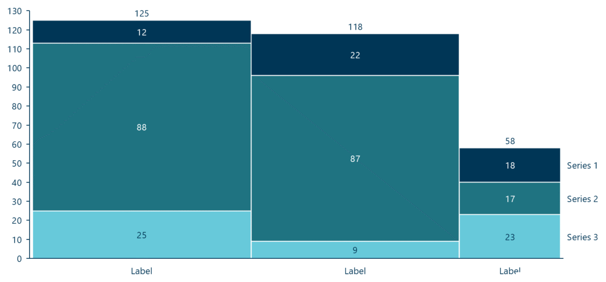
In a Mekko chart, column width shows each category’s size and segment height shows its composition.
- Click Ampler Charts in the ribbon and select Mekko from the chart menu.
- Left-click and drag the chart to the size you want — or hold Ctrl to place it in a pre-defined position.
- Enter your data in the data sheet: each column’s width reflects that category’s total size, and the stacked segments show its internal composition.
When to use it
Use a Mekko when two things matter at once — how big each category is and how it breaks down — the classic market map: market or segment size on the width, share or mix on the height. Reach for the 100% Mekko when composition and relative width matter but absolute totals don’t. Avoid it when precise value-reading is the point, when there are more than about seven categories, or when you need period-over-period change — a stacked or 100% stacked column reads more precisely there.
How consultants use it
The Marimekko is a strategy-consulting staple — McKinsey, BCG and Bain reach for it to map a market in a single picture. A few practices apply:
- Map a market in one view: width for market or segment size, height for share or mix — a ‘share of share’ picture that sizes the opportunity and shows who holds it at the same time
- Keep it to a handful of categories: the dual encoding gets hard to read beyond about seven columns, so group the long tail into an ‘Other’
- Don’t use it for precise comparison: widths and areas are judged approximately — when exact values or period-over-period change is the point, a stacked column is the honest choice
Used for market structure rather than precise readout, a Mekko turns two dimensions of a market into one decision-ready chart.
Tips & best practices
- Order categories by size (widest first) so the market map reads left to right.
- Group small categories into an ‘Other’ column to keep the chart legible.
- Use the 100% Mekko when composition matters more than absolute size.
What you can add to this chart
Decorators and elements you can layer onto a Mekko chart in Ampler Charts:
- Add total and level differences
- Add, position and format a value line
- Add a ridge line
- Add the Mekko total label
Availability
Part of Ampler Charts, included in Ampler for PowerPoint and the Ampler Suite, on Windows desktop PowerPoint.
Frequently asked questions
What is a Mekko chart?
A Mekko chart — also called a Marimekko chart — is a stacked column chart with variable column widths, so it shows two dimensions at once: each category’s relative size (width) and its internal composition (stacked height).
How do you make a Mekko chart in PowerPoint?
In Ampler Charts, click Ampler Charts, select Mekko, drag it to size, then enter your data — the column widths represent category size and the segments the composition.
What’s the difference between a Mekko and a 100% stacked column chart?
A 100% stacked column normalises every column to the same height and equal width; a Mekko keeps the extra dimension of width to show how big each category is, so it maps size and share together.
When should you use a Marimekko chart?
When both category size and composition matter — classically for market maps and market sizing — and there are only a handful of categories. Avoid it when you need precise value comparison or period-over-period change.