
A pie chart shows the parts of a single whole as slices of a circle — the simplest way to make one composition, at one point in time, land. Ampler Charts builds it natively in PowerPoint; add a hole in the centre for a headline figure and it becomes a doughnut chart. Use it sparingly, for a single clear message.
Quick answer: Click Ampler Charts and select Pie, drag the chart to size, then enter your data — each value becomes a slice, and the slices sum to the whole.
How to create it
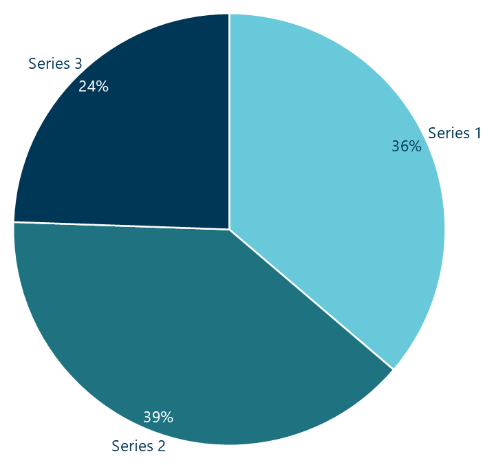
A pie chart: slices of a circle showing the parts of a single whole.
- Click Ampler Charts in the ribbon and select Pie from the chart menu.
- Left-click and drag the chart to the size you want — or hold Ctrl to place it in a pre-defined position.
- Enter your data in the data sheet: each value becomes a slice of the circle, and the slices sum to the whole.
When to use it
Use a pie chart for one part-to-whole split at a single point in time, with a small number of slices (about five or fewer) and one clearly dominant share. If the shares are similar, or you need to compare across categories or over time, a bar or 100% stacked column is clearer. Consultants use pies sparingly, to land one dominant number.
How consultants use it
In a consulting deck the pie is used sparingly, for a single dominant message. A few practices apply:
- Keep it to a few slices: about five or fewer, with clearly different shares — group the small ones into an ‘Other’
- Label the slices directly: put the category name and its share on or beside each slice so there is nothing to decode
- Highlight only the message: give the one slice that carries the point a stronger colour and leave the rest neutral
A pie is right for one clear part-to-whole message — and wrong when the shares are close or you need to compare.
Tips & best practices
- Keep to about five slices or fewer and group the rest into an ‘Other’.
- Label slices directly with the name and share; highlight only the slice that carries the message.
- Avoid a pie when the shares are similar — a bar chart compares them far better.
Availability
Part of Ampler Charts, included in Ampler for PowerPoint and the Ampler Suite, on Windows desktop PowerPoint.
Frequently asked questions
What is a pie chart?
A pie chart shows the parts of a single whole as slices of a circle, where each slice’s angle (and area) is proportional to its share of the total.
How do you make a pie chart in PowerPoint?
In Ampler Charts, click Ampler Charts, select Pie, drag it to size, then enter your data — each value becomes a slice.
What’s the difference between a pie and a doughnut chart?
A doughnut chart is a pie with a hole in the centre, which frees space for a headline figure such as a total or KPI; otherwise they show the same thing.
When should you not use a pie chart?
When there are many slices, the shares are similar, or you need to compare across categories or over time — a bar or 100% stacked chart is clearer.