
A stacked bar chart shows how parts add up to a whole across categories, laid out horizontally — each bar is a total split into stacked segments. It is the horizontal form of the stacked column, and the better choice when the category labels are long or there are many categories. Ampler Charts builds it natively in PowerPoint, and the same menu switches to a 100% stacked bar or a clustered bar.
Quick answer: Click Ampler Charts and select Stacked Bar, drag the chart to size, then enter your data — each series stacks along the bar, and the bar length is the category total.
How to create it
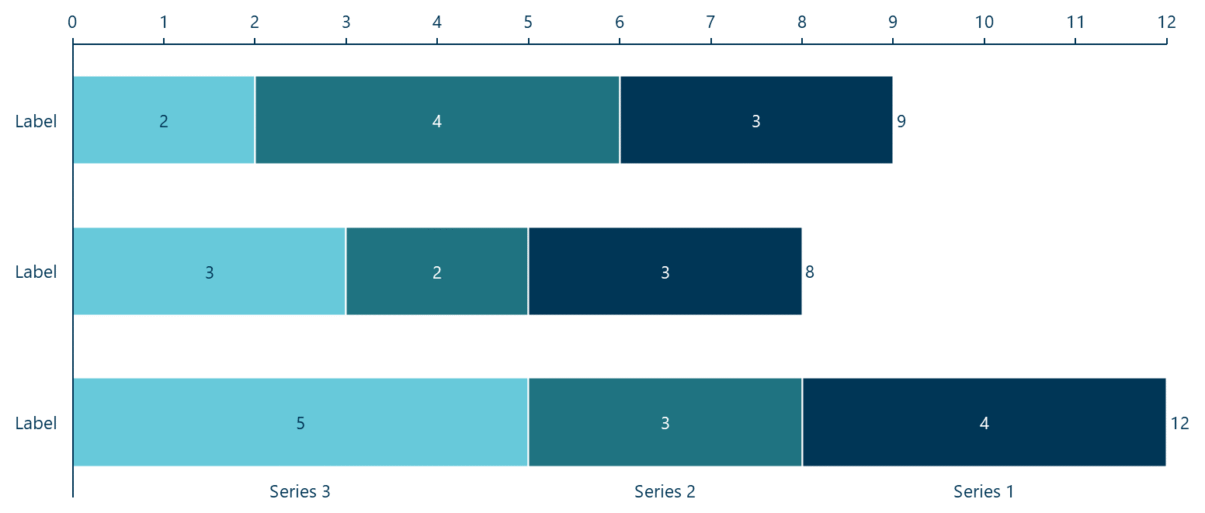
A stacked bar chart: each horizontal bar is a category total split into stacked segments.
- Click Ampler Charts in the ribbon and select Stacked Bar from the chart menu.
- Left-click and drag the chart to the size you want — or hold Ctrl to place it in a pre-defined position.
- Enter your data in the data sheet: each series stacks along the bar, and the bar length is the category total.
When to use it
Use a stacked bar when the total matters and you want to show its composition, and the categories have long labels or there are many of them — horizontal bars give the labels room and are easier to scan or rank. For a time series or a few short-label categories, a stacked column reads more naturally; if only the mix matters, use a 100% stacked bar.
How consultants use it
Bars suit long labels, many categories and ranked data — and the stacked bar adds a total on top of that. A few practices apply:
- Rank the bars: when the categories aren’t a time series, order the bars by size so the chart reads as a ranking from longest to shortest
- Give long labels room: horizontal bars leave space for full category names, so nothing has to be truncated or angled
- Keep the stack shallow: put the largest series at the start of each bar and hold the order steady; group a long tail into an ‘Other’
A stacked bar shows ‘how big, and made up of what’ while handling long labels and many categories.
Tips & best practices
- Order the bars by size for a ranking when the categories aren’t a time series.
- Put the largest series at the start of each bar and keep the order consistent.
- Prefer a stacked column for a short time series with brief labels.
What you can add to this chart
Decorators and elements you can layer onto a stacked bar chart in Ampler Charts:
- Add CAGR arrows
- Add series CAGRs
- Add total and level differences
- Add, position and format a value line
- Add connectors between series
- Add series shares
Availability
Part of Ampler Charts, included in Ampler for PowerPoint and the Ampler Suite, on Windows desktop PowerPoint.
Frequently asked questions
What is a stacked bar chart?
A stacked bar chart shows each category as a single horizontal bar split into stacked segments, so the bar length is the total and the segments show its composition.
How do you make a stacked bar chart in PowerPoint?
In Ampler Charts, click Ampler Charts, select Stacked Bar, drag it to size, then enter your data — each series stacks along the bar.
What’s the difference between a stacked bar and a stacked column chart?
They show the same thing; a stacked bar is horizontal, which suits long category labels, many categories and ranked data, while a stacked column is vertical and suits time series.
When should you use a stacked bar chart?
When the total and its composition both matter and the categories have long labels, are numerous, or should be ranked.