
Ampler Charts can add series shares to a stacked chart — a bracket on each column showing what share a series makes up of that column’s total. It works on the stacked and 100% stacked column and bar charts, and on combination charts.
Quick answer: Right-click the chart and toggle on Series shares — each column gets a bracket showing the share the series represents of the column total.
How to add it
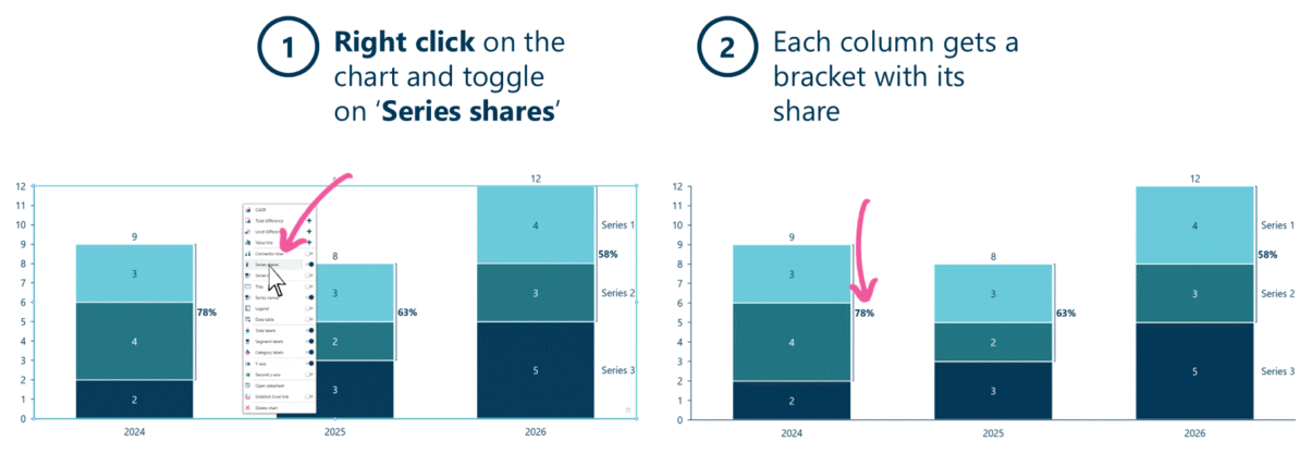
Toggle on Series shares to bracket each column with its share of the total.
- Right-click on the stacked chart and toggle on Series shares.
- Each column gets a bracket showing its share of the column total.
When to use it
Use series shares when the point is concentration — how much of each column a series, or a group of series, accounts for. The bracket states the proportion on the chart (“the top tier is 58% of the total”) without a separate calculation, and lets you watch that share move across columns.
How consultants use it
Series shares turn a stacked chart into a concentration argument. A few practices apply:
- Bracket the series that carries the point: the share of the top tier, or the bottom two — whichever proportion is the message; the bracket directs the eye to it
- Watch the share across columns: a share that climbs or slips period to period is a mix-shift story the raw stack heights hide
- Show share and level together: pair the bracket with total labels so the reader sees both the proportion and the absolute size
A stacked chart shows the parts; series shares state how much they add up to — which is usually the actual point.
Tips & best practices
- Bracket the tier whose proportion is the argument, not every series.
- Read the share across columns for a mix-shift story; on a 100% chart, a percent indicator reads the whole scale instead.
- Combine with total labels for share plus absolute size.
Availability
Part of Ampler Charts, included in Ampler for PowerPoint and the Ampler Suite, on Windows desktop PowerPoint.
Frequently asked questions
How do you show a series’ share of a stacked column in PowerPoint?
In Ampler Charts, right-click the stacked chart and toggle on Series shares — each column gets a bracket showing the share the series makes up of the column total.
What does series shares show?
It shows what proportion of each column a series (or group of series) represents, drawn as a bracket with the percentage — a concentration read without a separate calculation.
What’s the difference between series shares and a 100% chart?
A 100% chart rescales every column to 100% to show mix; series shares keep the absolute stacked chart and add a bracket showing one series’ share — so you see both level and proportion.
Which charts support series shares?
Stacked and 100% stacked column and bar charts, and combination charts.