
Ampler Charts opens a familiar Excel-style data sheet for the chart, so you edit the chart’s data directly and it updates as you type.
Quick answer: Double-click the chart, or click the Excel icon in the lower-right corner, and edit the chart’s data in the data sheet that opens.
How to use it
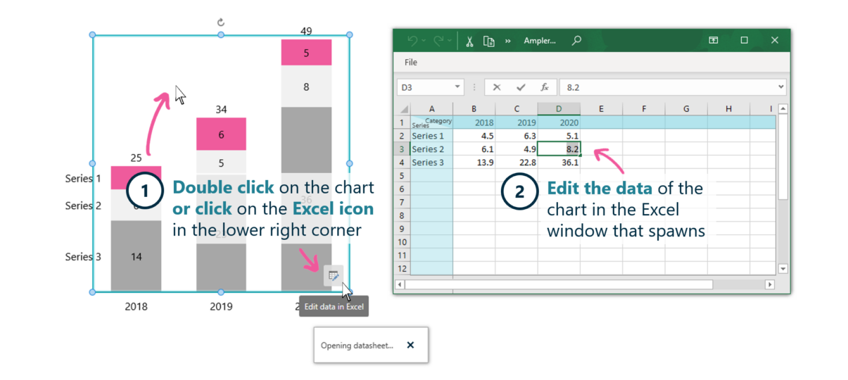
Double-click the chart to open its data sheet.
- Double-click on the chart, or click the Excel icon in the lower-right corner.
- Edit the data of the chart in the Excel window that opens.
The chart updates as you edit its data, so building and adjusting a chart is done in a familiar spreadsheet.
When to use it
Open the data sheet for quick, self-contained edits; establish an Excel link instead when the data lives in a model you maintain and needs to stay in sync.
How consultants use it
The chart’s data is where its integrity starts, and an Excel-style sheet keeps editing familiar. Three habits apply:
- Edit in a familiar sheet: chart data is edited in an Excel-like grid
- See it update live: the chart reflects changes as you type
- Link when the model changes: a linked Excel source keeps the chart in sync
The data sheet makes editing a chart’s data quick and familiar.
Tips & best practices
- Use the data sheet for self-contained charts.
- Link to Excel when the data comes from a model that changes.
- Use the built-in data-sheet functions for quick transforms.
Availability
Part of Ampler Charts, included in Ampler for PowerPoint and the Ampler Suite, on Windows desktop PowerPoint.
Frequently asked questions
How do you edit the data behind an Ampler chart?
Double-click the chart (or click the Excel icon in the lower-right corner) to open the data sheet, then edit the data there.
How do you open a chart’s data in Ampler Charts?
Double-click the chart, or use the Excel icon in the corner, to open its data sheet.
Should you use the data sheet or link to Excel?
Use the data sheet for self-contained charts; link to Excel when the data lives in a model that changes and must stay in sync.
Does the chart update as you edit the data?
Yes. The chart reflects changes to the data sheet as you make them.