
Ampler Charts can take a segment’s fill colour straight from the linked Excel cell, so conditional formatting or a colour scheme built in Excel carries through to the chart.
Quick answer: With an Excel link established, select the segment or series (hold Shift for several), open the Format menu, and under fill colour choose Use Excel fill colour; the chart matches the Excel cell colours.
How to use it
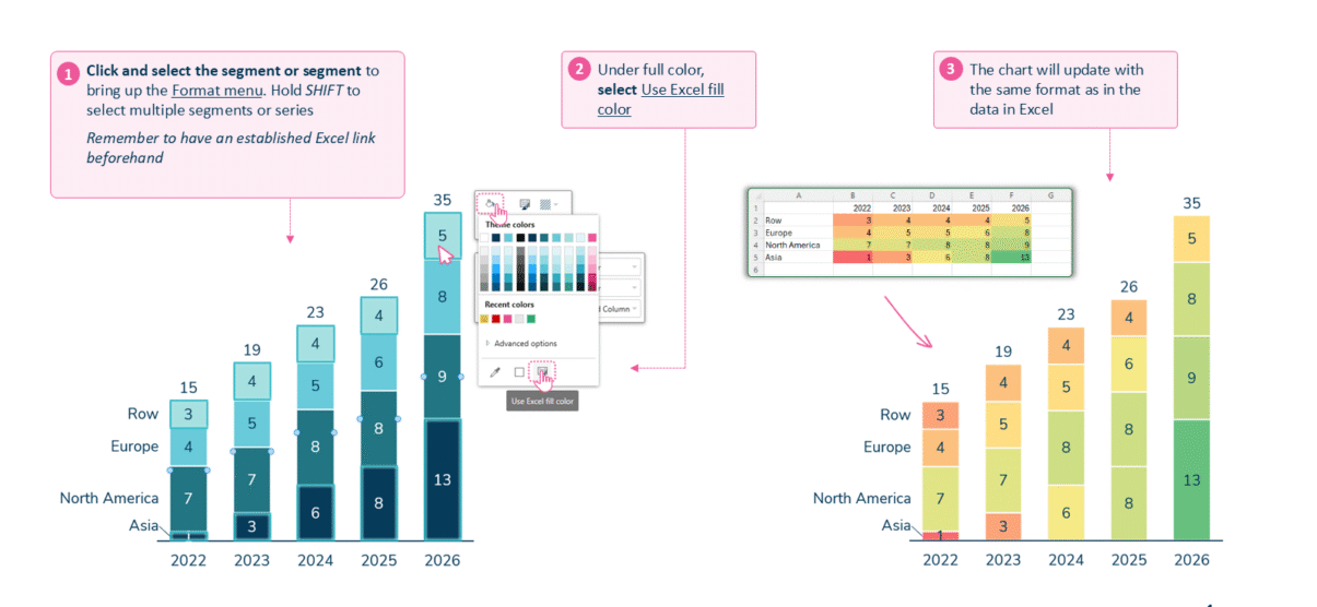
Select a segment, then choose Use Excel fill colour in the Format menu.
- Click and select the segment or series to bring up the Format menu. Hold Shift to select multiple segments or series.
- Under fill colour, select Use Excel fill colour.
- The chart updates with the same formatting as the data in Excel.
An Excel link must be established beforehand for the colours to carry through.
When to use it
Use Excel fill colours when the colour already carries meaning in the model — a RAG status, a highlighted scenario, or a heat-map — so the chart stays in sync with the workbook instead of being recoloured by hand.
How consultants use it
In consulting decks colour carries meaning, not decoration, and the discipline is to keep that meaning consistent from model to slide. A few practices apply:
- Make colour mean one thing: a RAG or scenario colour should signal the same status everywhere, tied to a measurable rule — for example green within 5% of budget, red beyond 10%
- Drive it from the model: reading the fill from linked Excel keeps the coding identical across every chart built on that model, with no hand-recolouring to drift out of sync
- Don’t rely on colour alone: around one in twelve men cannot reliably separate red from green, so reinforce a status with labels or values as well as colour
Taking fill colours from Excel keeps a chart’s status coding consistent, rule-based, and legible.
Tips & best practices
- Establish the Excel link before applying — without it there are no colours to inherit.
- Hold Shift to apply the setting to several segments or series at once.
- Refresh the link after changing colours in Excel so the chart picks them up.
Availability
Part of Ampler Charts, included in Ampler for PowerPoint and the Ampler Suite, on Windows desktop PowerPoint.
Frequently asked questions
How do you apply Excel cell colours to a chart in Ampler Charts?
Select the segment or series, open the Format menu, and under fill colour choose Use Excel fill colour — with an Excel link already established.
Do you need an Excel link to use Excel fill colours?
Yes. The chart reads the colours from the linked cells, so the Excel link must be established first.
Can you apply Excel colours to several segments at once?
Yes. Hold Shift to select multiple segments or series before choosing Use Excel fill colour.
Will the chart update if the Excel colours change?
Refresh the data link and the chart picks up the new fill colours from Excel.