
When a chart is linked to Excel, Ampler can read its 100% baseline from a dedicated row in the workbook, so the percentage labels are driven by Excel rather than typed into the chart.
Quick answer: In Excel, insert a new second row in the data range and tick Total (100%) row when establishing the link; enter each category’s 100% value in that row, refresh, then set Label content to include percentages.
How to use it
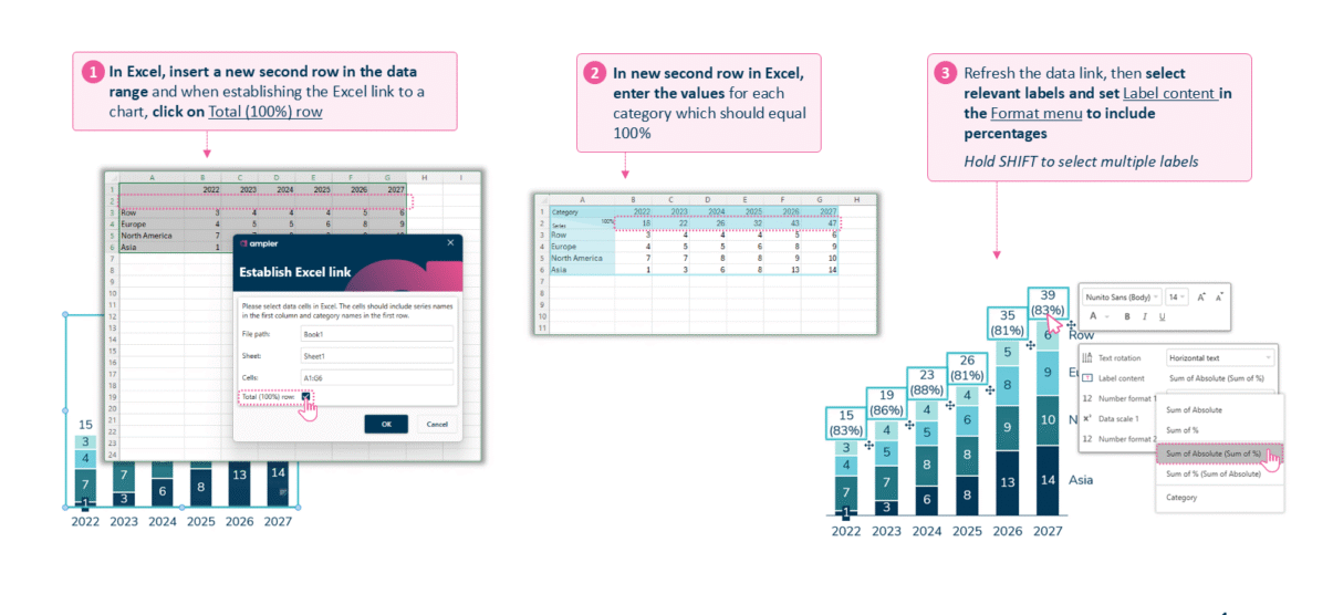
Tick Total (100%) row when linking, then enter the 100% values in Excel.
- In Excel, insert a new second row in the data range, and when establishing the Excel link to a chart, tick Total (100%) row.
- In the new second row in Excel, enter the values for each category that should equal 100%.
- Refresh the data link, then select the relevant labels and set Label content in the Format menu to include percentages. Hold Shift to select multiple labels.
When to use it
Add the 100% row in Excel when the baseline lives in the model — a budget, a plan, or a target that already sits in the workbook — so the chart’s shares update whenever the model does.
How consultants use it
When the numbers live in a model, the baseline for a share chart should live there too, so the mix argument updates with the workbook. A few practices apply:
- Put the target in the model: hold the 100% figure — budget, plan, or capacity — as a row in Excel, maintained alongside the data it is compared against
- Let the shares self-update: refreshing the link recomputes every percentage, so a re-forecast flows straight to the slide without re-typing
- Guard against false reads: when totals vary widely a 100%-based view is the honest one, but keep the absolutes to hand where growth in size is part of the story
A 100% row in Excel ties a chart’s shares to the plan in the model and keeps them true as the model moves.
Tips & best practices
- Tick Total (100%) row at the moment you establish the Excel link.
- Refresh the link after editing the row, then set Label content to percentage.
- Hold Shift to set the label content on several series at once.
Availability
Part of Ampler Charts, included in Ampler for PowerPoint and the Ampler Suite, on Windows desktop PowerPoint.
Frequently asked questions
How do you add a 100% row to a linked chart in Ampler Charts?
In Excel, insert a new second row in the data range and tick Total (100%) row when linking; enter each category’s 100% value, refresh, then set the label content to percentage.
Should the 100% row go in Excel or the data sheet?
Put it in Excel when the chart is linked to a workbook and the baseline is maintained there; use a custom 100% row in the data sheet for an unlinked chart.
Why aren’t the percentages updating from Excel?
Refresh the data link after editing the 100% row, and make sure Label content is set to include percentages.
Can several series share one 100% row?
Yes. Select the relevant labels — hold Shift for several — and set their label content to percentage.