
Ampler Charts can show each segment as a percentage of a custom total, so a stacked chart displays shares against a 100% baseline you define rather than the column’s own sum.
Quick answer: Insert a blank row as row 2 in the data sheet, click Toggle 100% = row in the top menu, then enter the value that should equal 100% for each category; the chart recalculates the percentages.
How to use it
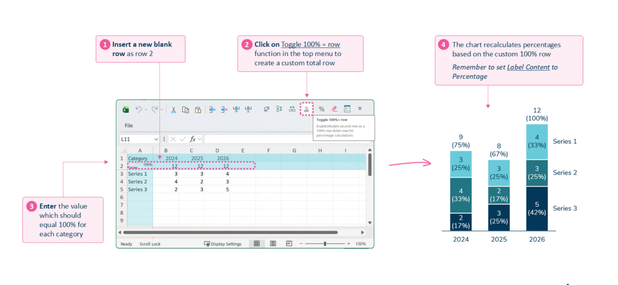
Insert a blank row, toggle the 100% row, and enter each category’s 100% value.
- Insert a new blank row as row 2 in the data sheet.
- Click Toggle 100% = row in the top menu to create a custom total row.
- Enter the value that should equal 100% for each category.
- The chart recalculates the percentages based on the custom 100% row. Remember to set Label content to Percentage.
When to use it
Use a custom 100% row when the shares should be measured against a fixed target or plan rather than the column total — for example showing actuals as a percentage of budget, or each year against a common baseline.
How consultants use it
Consultants use share-of-total charts to argue about mix, and the baseline they divide by is a deliberate choice. A few practices keep it rigorous:
- Choose the denominator on purpose: measure shares against budget, plan, or prior year — not just the column’s own sum — so the mix is comparable across categories
- Keep the composition legible: three to five segments, largest at the base, percentages labelled inside, and slivers under about 5% suppressed
- Keep the absolute in view: when size still matters to the decision, pair the shares with the totals so a shifting mix isn’t misread as growth
A custom 100% row lets a chart make its mix argument against the baseline the decision actually turns on.
Tips & best practices
- Set Label content to Percentage so the shares actually show.
- Keep the 100% value consistent across categories you want to compare.
- A custom baseline can exceed the visible segments — the remainder is the gap to target.
Availability
Part of Ampler Charts, included in Ampler for PowerPoint and the Ampler Suite, on Windows desktop PowerPoint.
Frequently asked questions
How do you add a custom 100% row to a chart in Ampler Charts?
Insert a blank row as row 2 in the data sheet, click Toggle 100% = row in the top menu, then enter the value that equals 100% for each category.
What is a 100% row used for in a stacked chart?
It sets the denominator for the percentage labels, so each segment is shown as a share of a total you define rather than the column’s own sum.
How is a custom 100% row different from a 100% stacked chart?
A 100% stacked chart normalises every column to its own total; a custom 100% row measures the shares against a fixed value you enter, such as budget or plan.
Why aren’t my percentages showing after adding a 100% row?
Set Label content to Percentage in the Format menu so the labels display the calculated shares.