
Ampler Charts can shade a Gantt behind a row or across a time period, drawing the eye to a workstream or highlighting a phase such as a freeze or a review window.
Quick answer: Right-click a row or column and toggle on Row shade to shade behind a row, or select Shade to shade a period; then select the shade and drag its handles to set the size and position.
How to use it
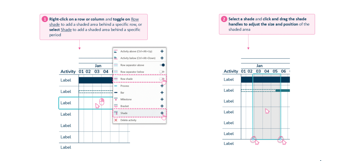
Toggle Row shade for a row, or Shade for a period, then drag the handles.
- Right-click a row or column and toggle on Row shade to add a shaded area behind a specific row, or select Shade to add a shaded area behind a specific period.
- Select the shade, then click and drag the shade handles to adjust the size and position of the shaded area.
When to use it
Shade a period to mark a phase — a blackout, a peak season, a review gate — or shade a row to spotlight one workstream, so the emphasis is visual rather than buried in labels.
How consultants use it
A project timeline often needs to foreground one thing for a steering committee, and shading does it without adding clutter. A few practices apply:
- Highlight a phase: a shaded period marks a freeze, a peak, or a review window so the audience’s eye lands there first
- Spotlight a workstream: a row shade draws attention to one activity line among many
- Emphasise without more labels: the highlight is visual, keeping the data-ink on the plan rather than on extra text
Shading focuses a Gantt on the row or period that matters most to the message.
Tips & best practices
- Use Row shade for a workstream and Shade for a time period.
- Drag the shade handles to line the highlight up exactly with the dates.
- Keep shading sparing — one or two highlights read; many compete.
Availability
Part of Ampler Charts, included in Ampler for PowerPoint and the Ampler Suite, on Windows desktop PowerPoint.
Frequently asked questions
How do you shade a time period on a Gantt chart in Ampler Charts?
Right-click a row or column and select Shade, then drag the handles to cover the period you want to highlight.
How do you shade behind a single row?
Right-click the row and toggle on Row shade to add a shaded band behind that activity line.
How do you resize or move a shade?
Select the shade and drag its handles to adjust its size and position.
What should you use shading for on a Gantt?
To mark a phase such as a freeze or peak season, or to spotlight a single workstream, without adding more labels.