
Ampler Charts lets you set how wide the columns or bars are by dragging the gap between them, so the bars carry the right visual weight whatever the chart’s size or number of categories.
Quick answer: Select any series in the chart, then drag the centre handles left or right to the gap width you want; to return to the default, drag the handle back to 70%.
How to use it
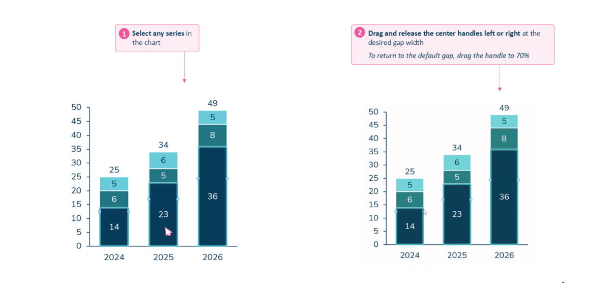
Select a series and drag the centre handles to set the column width.
- Select any series in the chart.
- Drag and release the centre handles left or right to the desired gap width.
To return to the default gap, drag the handle back to 70%.
When to use it
Adjust the width when the default looks wrong for the chart — spindly bars lost on a wide chart, or columns crowding each other when there are many categories — so the bars read at the right weight.
How consultants use it
Bar width is a data-ink decision, not decoration, and consultants tune it so the bars — not the gaps — carry the chart. A few practices apply:
- Keep the gap narrower than the bars: when the space between bars is less than the bars themselves, the data is the dominant mark and the chart reads as substantial rather than spindly
- Give the bars honest weight: very thin bars read as less important and very wide ones as more important, so the width should reflect the data’s weight rather than distort it
- Stay consistent across the deck: similar charts should use a similar gap so a set of slides looks coherent
Setting the column width puts the visual weight on the data and keeps a chart looking deliberate.
Tips & best practices
- Drag the handle to 70% to restore the default gap.
- Keep the gap narrower than the bars so the data stays the dominant mark.
- Use a consistent gap across similar charts so a deck reads as one set.
Availability
Part of Ampler Charts, included in Ampler for PowerPoint and the Ampler Suite, on Windows desktop PowerPoint.
Frequently asked questions
How do you change the width of columns in Ampler Charts?
Select any series, then drag the centre handles left or right to set the gap between the columns.
How do you make bars thicker or thinner?
Drag the centre handles outward for thicker bars with a smaller gap, or inward for thinner bars with a larger gap.
How do you reset the column gap to the default?
Drag the gap handle back to 70%, which is the default gap width.
Why do my columns look too thin or too crowded?
The gap width doesn’t suit the chart — select a series and drag the handles until the bars carry the right weight for the size and number of categories.