
Ampler Charts can put several charts on one shared Y-axis scale, so a bar of a given value is the same height in every chart and the set can be compared at a glance.
Quick answer: Hold Ctrl and select the charts, right-click one of them, and choose Same scale; all the selected charts adopt the same Y-axis minimum and maximum.
How to use it
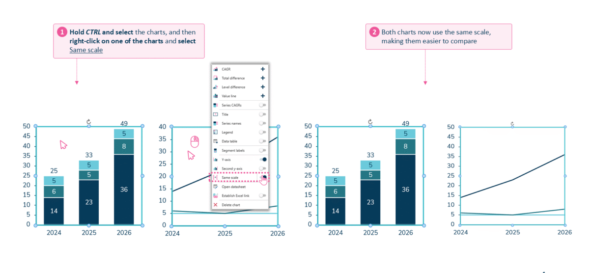
Ctrl-select the charts, right-click, and choose Same scale.
- Hold Ctrl and select the charts, then right-click on one of them and select Same scale.
- All the selected charts now use the same scale, making them easier to compare.
When to use it
Use one scale whenever charts sit side by side and the reader will compare heights — small multiples, a row of regional or business-unit charts, this-year-versus-last — so a taller bar genuinely means a bigger number.
How consultants use it
‘Small multiples’ — a row of charts that share an encoding — only work if they also share a scale, and consultants treat that as non-negotiable. A few practices apply:
- Give every panel the same min and max: matching the axis limits across the set is what lets a reader compare magnitudes between charts, not just within one
- Protect the comparison from distortion: a scale that changes from chart to chart makes a difference look larger or smaller than it is — the classic way a set of charts misleads
- Hold the rest of the encoding constant: same colours, same series order, same scale in every panel, so only the data varies between them
A shared Y-axis scale is what turns a row of charts into an honest, comparable set.
Tips & best practices
- Select every chart that should match before choosing Same scale.
- A shared scale is essential for side-by-side small multiples — differing scales mislead.
- If one chart has a genuine outlier, add an axis break on that chart rather than dropping the shared scale for the whole set.
Availability
Part of Ampler Charts, included in Ampler for PowerPoint and the Ampler Suite, on Windows desktop PowerPoint.
Frequently asked questions
How do you make two charts use the same Y-axis scale in Ampler Charts?
Hold Ctrl, select the charts, right-click one, and choose Same scale — all the selected charts take the same minimum and maximum.
Why should side-by-side charts share a scale?
So equal bar heights mean equal values; a scale that changes between charts makes differences look bigger or smaller than they really are.
Can you apply the same scale to more than two charts?
Yes. Ctrl-select all the charts that should match before choosing Same scale.
What if one chart has a much larger range than the others?
Add an axis break on that chart, or give it its own scale, rather than stretching a shared scale that flattens the rest.