
Ampler Charts lets you add an axis break to a series, so a chart with a large outlier can show the smaller values without being flattened.
Quick answer: Right-click a series at the position for the break and select Add break; left-click the break to format it, and drag it to change the scale.
How to use it
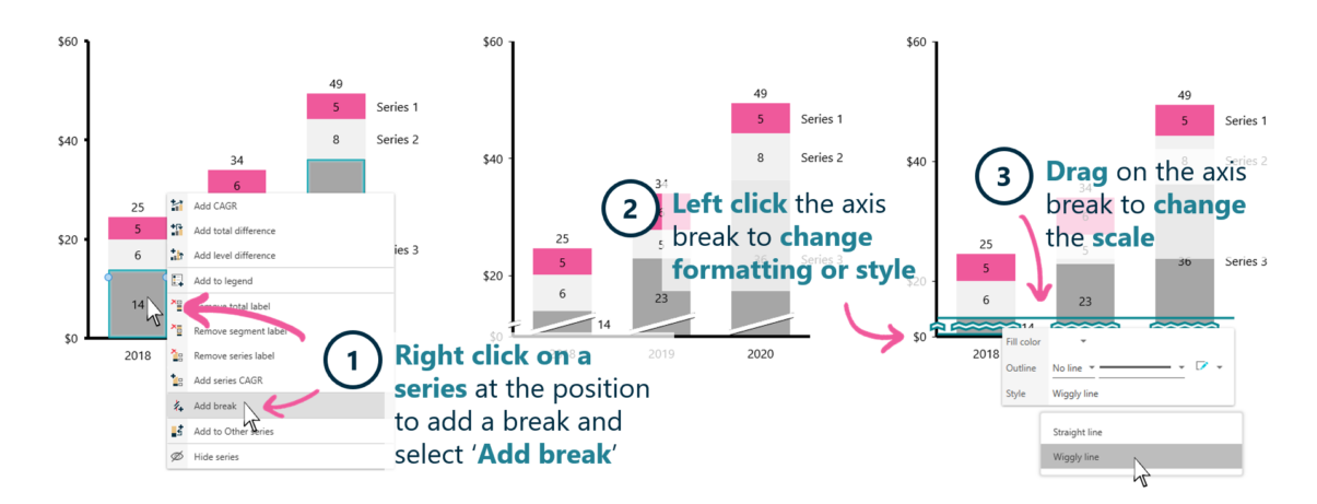
Right-click a series to add a break, then format or drag it.
- Right-click a series at the position where the break should go and select Add break.
- Left-click the axis break to change its formatting or style.
- Drag on the axis break to change the scale.
An axis break compresses part of the scale, so a chart dominated by one large value can still show the detail in the smaller ones.
When to use it
Use an axis break only when a single large value would otherwise flatten the rest — and mark it clearly. If the outlier is the point, a note or a different chart is often better than compressing the scale.
How consultants use it
An axis break is a useful tool used carefully — it must aid clarity, not mislead. Three conventions apply:
- Show detail despite an outlier: the break lets the smaller values remain readable
- Make the break visible: a clearly-marked break signals the scale change to the reader
- Use it honestly: a break is used to aid reading, never to disguise a difference
An axis break keeps a chart readable when one value dominates — used transparently.
Tips & best practices
- Mark the break clearly so readers see the scale changes.
- Use it only where an outlier would otherwise flatten the chart.
- Never use a break to hide the size of a difference — that misleads.
- Consider whether a different chart type tells the story better.
Availability
Part of Ampler Charts, included in Ampler for PowerPoint and the Ampler Suite, on Windows desktop PowerPoint.
Frequently asked questions
How do you add an axis break in a chart?
Right-click a series at the break position in Ampler Charts and select Add break. Left-click it to format, and drag it to change the scale.
When should you use an axis break?
When one large value would otherwise flatten the smaller ones — the break keeps the detail readable, and should be clearly marked.
Is it OK to use an axis break in a chart?
Yes, when used transparently to keep small values readable next to a large one. It should never be used to disguise the size of a difference.
How do you format an axis break?
Left-click the break to change its formatting or style, and drag it to adjust the scale.