
Ampler Charts lets you format an axis just by clicking it — open the format menu for the Y-axis or X-axis and change its styling, such as the outline weight.
Quick answer: Left-click the Y-axis (or X-axis) and change the formatting from the menu — for example the outline weight.
How to use it
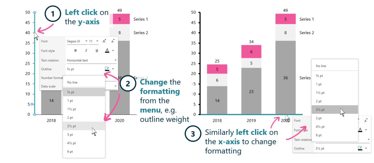
Click the axis to open its format menu.
- Left-click on the Y-axis.
- Change the formatting from the menu, for example the outline weight.
- Left-click the X-axis in the same way to change its formatting.
Clicking an axis opens the format menu for exactly that element, so styling an axis is direct rather than hunting through dialogs.
When to use it
Reach for click-to-format when you need to restyle one axis without touching the rest of the chart — for example lightening an axis line so it sits behind the data.
How consultants use it
Axis styling is part of a clean, understated exhibit — the axis should support the data, not compete with it. Three habits apply:
- Understated axes: axis lines are styled to sit quietly behind the data
- Direct formatting: clicking the axis opens exactly its options
- Consistent styling: axes look the same across the exhibits in a deck
Click-to-format keeps axis styling direct and consistent.
Tips & best practices
- Keep axis lines light so they don’t dominate the chart.
- Click an element directly to format just that element.
- Match axis styling across related charts.
Availability
Part of Ampler Charts, included in Ampler for PowerPoint and the Ampler Suite, on Windows desktop PowerPoint.
Frequently asked questions
How do you format a chart axis in Ampler Charts?
Left-click the axis to open its format menu, then change the styling — for example the outline weight. The same works for the X-axis.
How do you select just the axis to format it?
Left-click directly on the axis; Ampler Charts opens the format menu for that element.
How do you make chart axis lines less prominent?
Click the axis and lighten its outline weight so the axis sits behind the data rather than competing with it.
Can you format the X-axis the same way?
Yes. Left-click the X-axis to open its formatting options.