In this detailed guide we will explain everything about waterfall charts. So you will be able to make a professional dynamic chart in Excel and PowerPoint. Let’s start with the basics – what is a waterfall chart?
What is a Waterfall Chart?
Introduced by world famous consultancy firm McKinsey, they are sometimes referred to as a bridge chart, cascade chart, Mario chart or even a flying bricks chart because of the floating columns. A beloved child do have many names!
Waterfall charts are a data visualization tool that helps to understand the cumulative effect of sequentially positive and negative values. The row represents on the horizontal axis the individual components, often on a timeline, and the vertical axis shows the magnitude of the changes.
Typically the chart encompasses a sequence of vertical columns, which represents a distinct category. The diagram has a base value, succeeded by either ascending (positive values) or descending (negative vales) columns from the base value.
The length of each bar indicates the magnitude of the change. The cumulative outcome are summed op at the end of the chart in a column containing all contributing elements.
They can either be a build-up, which is a chart used to show the accumulation of components adding to a cumulative sum or a build-down, which is a chart that break down the cumulative sum to lesser components.
Use Cases of Waterfall Charts
Waterfall charts or bridge charts are often used to visualize financial statements, stock trading, project progress or budget management. They are extremely useful for these kinds of visualizations because they make it crystal-clear how the individual components influence the outcome.
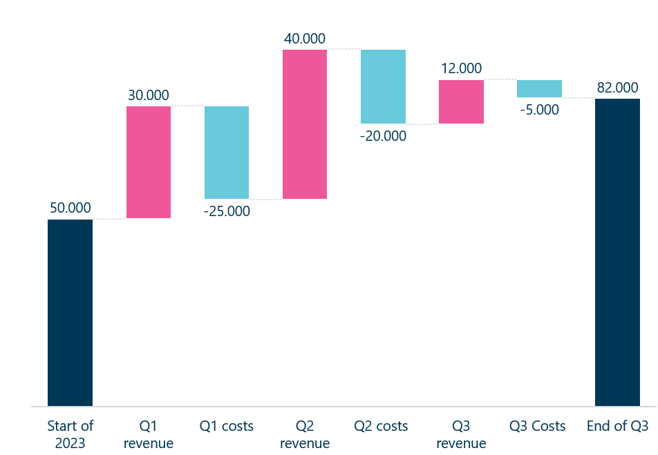
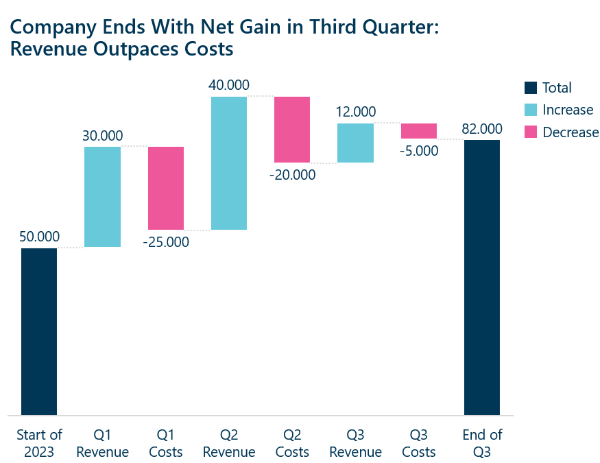
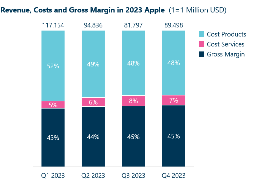
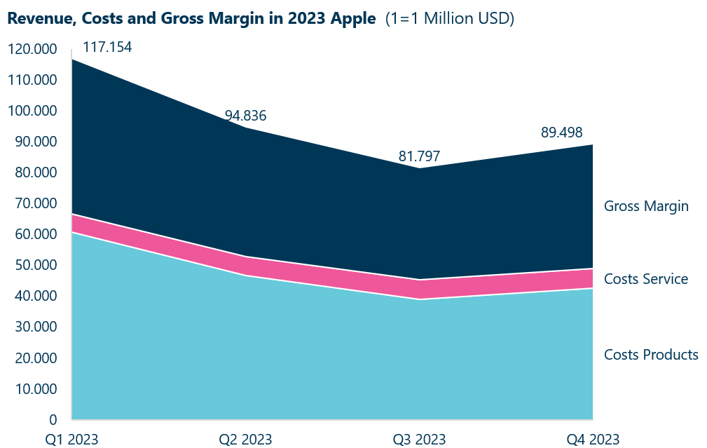
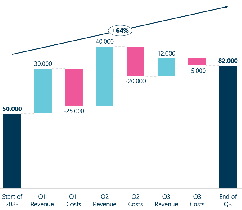
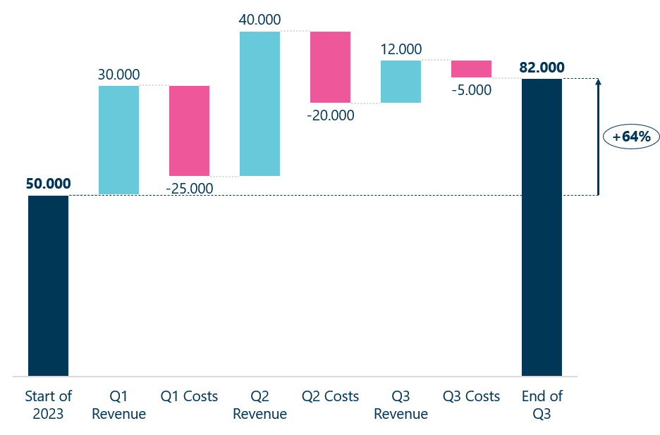
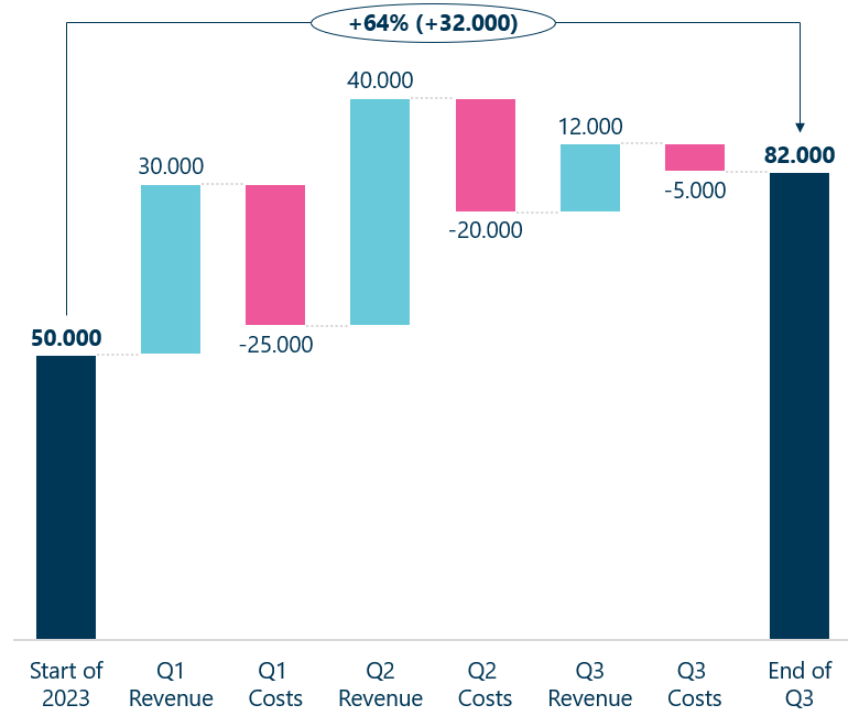
Especially are they significant for financial analysts and other decision makers looking for the driving factors underpinning the results. Down below we have illustrated a typical waterfall chart, showing the financial performance of Apple after Q1 2023.
As seen it clearly shows revenue and costs by ascending or descending columns. Further, the columns are in different colors indicating positive or negative effect on the total which is summed up at the end of the chart.
Connector lines helps the reader to see where we are in the sequential data. Without the connector lines the floating columns will make it hard for the reader to follow the sequence.
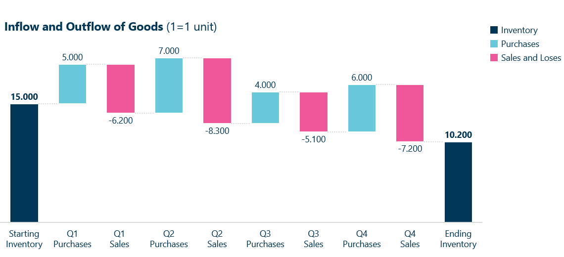
As mentioned they are also useful for other applications such as inventory management, which can give a comprehensive view of stock levels, restocking needs and overall inventory flow. An example is provided below:
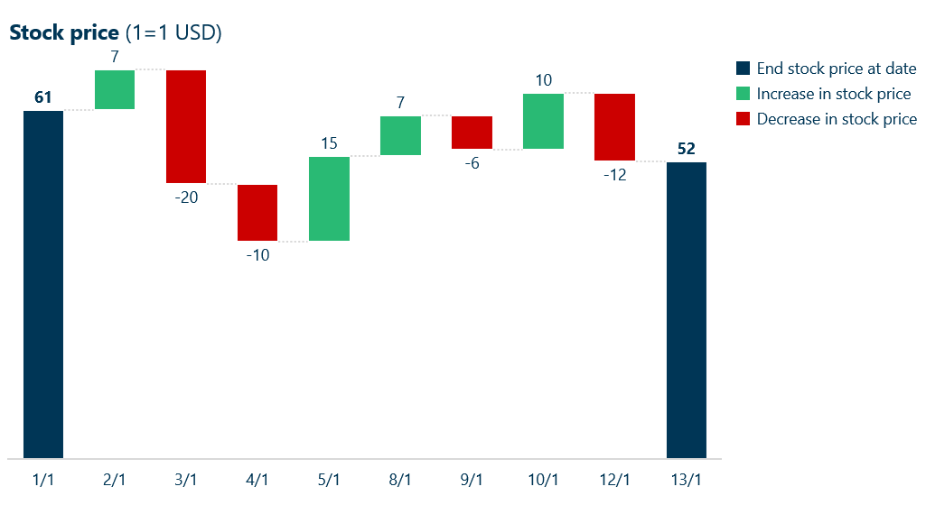
They can also be used to visualize the change in a stock price:
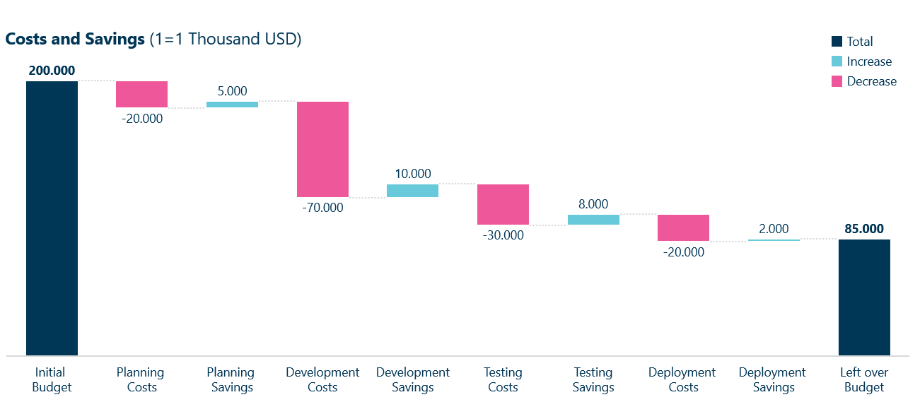
Or a project allocation, where the waterfall chart helps keeping track on costs and savings in each stage of the project:
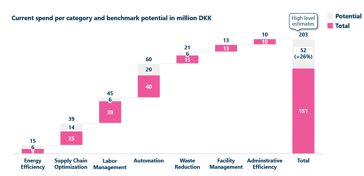
You can also use colors to indicate multiple insights, as shown down below it can be used to illustrate cost reduction potential, where the current costs are shown at the top of the column, the potential savings are shaded and changed cost are colored. This example goes to show how versatile this chart type is.
Now, let’s look at how to make a waterfall chart.
How to Create a Waterfall Chart in PowerPoint: Step by Step
There are some options for creating waterfall charts for example Power Bi, but in this guide we will use Ampler as it’s the most intuitive way to create waterfall charts. Ampler Charts is a PowerPoint Chart add-in for consultants. In the following, we will create a waterfall chart using this add-in.
Watch the video or read through the step-by-step guide below to learn how to make a well-designed waterfall chart.
Step 1: Assert if It’s the Best Option
As always you need to make sure that you use the best chart for the information you are trying to convey. A waterfall chart is primarily used to illustrate positive and negative changes in sequence or a break-down of a culminative sum, if it doesn’t contain any of these features then the chart isn’t suitable.
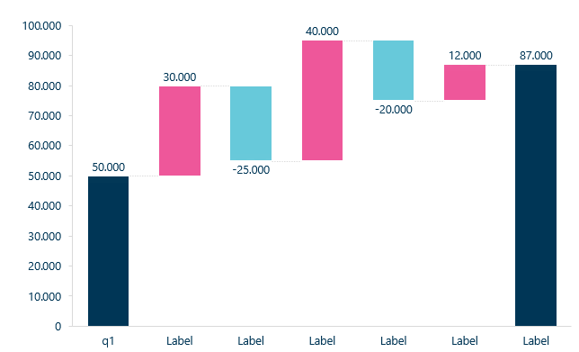
Let’s use one of the earlier versions shown before as an example. In the following we will use Ampler as it’s great at creating dynamic waterfall charts. No matter what add-in you use the steps are more less the same. We recommend using a add-in if you use these in a professional context as the Microsoft build-in chart is substandard.
We will create a waterfall chart based on the financial example provided at the beginning of the article.
Step 2: Insert Waterfall Chart
You can use PowerPoints own pre-set waterfall chart found under the insert tab, however it isn’t visually appealing. There some different add-ins, but look no further than Ampler Charts as it’s very intuitive and customizable to your needs.
To create a waterfall chart using Ampler, simply plot it in the following way:
Click on Ampler ribbon
Click on Ampler Charts
Choose Waterfall Chart and insert in PowerPoint
Step 3: Input Data
To change the data you can simply input it in the following way
Double click on the chart and open the Excel table
Plot in the numeric data range
To change an individual data point just click and change it
The chart instantly fit the data and calculate the cumulative total. No need to make a ending balance the chart tool will take care of that for you.
Tip: If you want to plot in more data or change data series after making a chart just copy paste it in – chart instantly fits the new data
Add Positive and Negative Values in Ampler
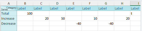
When changing the data or when you create a waterfall chart with Ampler make sure to follow these rules:
The starting value need to start at total cell
Make sure that positive values are in increase cell
Make sure that negative values in the decrease cell (needs to be negative numbers)
Add a “t” to the total cell at the end of the datasheet to get the final value.
Tip: If you want an intermediate culminative column add an “e” in the total series cell
Step 4: Customize Your Waterfall Chart
After plotting in the data, it’s time to customize the chart:
Make sure the negative and positive values are color coded by using shape fill
Change the data labels
To add connector lines – toggle on the connector lines box (waterfall connectors)
Step 5: Finalize Chart
Time to finalize the chart! Remember don’t include unnecessary elements that confuse the audience you want to convey the information to. However, make sure the chart has the following elements:
A title to clarify the context
That all the columns are visible, if not resize the chart
Tip: The chart title should be an action title!
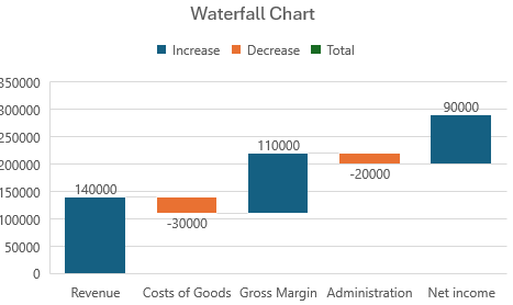
How to Make an Excel Waterfall Chart
Do you rather want to create a waterfall chart in Excel? Microsoft Excel has it’s own build in chart tools which can create a waterfall chart. A waterfall chart in Excel is rather straightforward!
Follow the guide below:
Select your data table
Click the insert tab and insert waterfall chart. (Can also use all charts tab in recommended charts)
Use the design and format tabs to customize the look of your chart
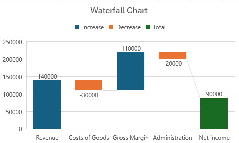
If your data includes values as subtotals or totals do the following:
Select a data point on the chart
Right-click and select format data point open the task pane.
Select set as total
Tip: Want to show or hide connector lines in waterfall chart in Excel? Right-click a data series to open the format data series pane and clear the show connector lines box
Even know it’s possible to create a waterfall chart in Excel and PowerPoint, it’s clear that the visual appearance is lacking a punch! For a more professional and visual alluring look, it’s recommend to use a add-in such as Ampler. Especially if it’s used in a business setting.
Best Practices for Waterfall charts
There is some clear guidelines to check for after you have finished making your waterfall chart
Make sure increases and decreases are clearly distinguish
The sequence of changes need to follow from left to right
Highlight the start value and the end value
Make sure the vertical axis has the same scale
Use connector lines to simplify the flow of the changes
If the chart check all of these five things then your waterfall chart are easily accessible to the intended audience.
Benefits and Disadvantages of Waterfall Charts
Waterfall charts offer significant benefits for understanding data. As stated before they provide a clear and intuitive way of presenting how an initial value is affected by negative and positive changes. The step-by-step data visualization helps to understand for example how costs affect the bottom line of a company.
Below we give a clear overview of benefits of using these charts rather than others as well as when they are better to avoid
Waterfall charts provide many benefits as listed:
They have a clear starting value
They show how individual components contributes to a final total
Makes it clear what add or subtract from the total
The data can be used sequential making it easy to see the progression over time
Especially useful for financial data (e.g., income statements) or operational metrics (e.g., inventory levels)
Sums up to a culminative result in the end
However, in some cases, they are better to avoid:
To many steps makes them cluttered
If the changes are to different in magnitude they can make some of them impossible to see
Not suitable for data that doesn’t have cumulative effect
Not great at showing trends over long periods of time which are better visualized with line or area charts
Different Kind of Waterfall Chart
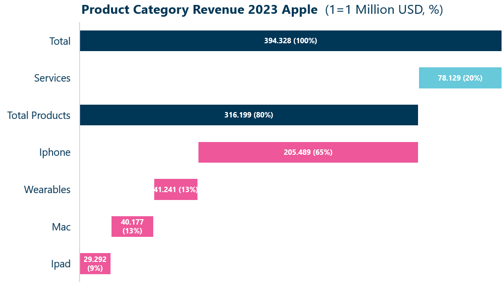
Although not a substitute for a waterfall chart, a vertical waterfall chart is a different kind not used as much as its counterpart. In this chart type the data points are on the vertical axis rather than the horizontal axis.
These charts are often used to show how a cumulative total is made up and then goes to show how to break them down in smaller parts. In our example it shows how Apples total revenue in 2023 is divided among services and products.
Substitutes for Waterfall Charts
There are lots of substitutes to use instead of a waterfall chart. However, its important to think of the intent of the data you want to present. As mentioned waterfall charts are useful for sequential data that show how intermediated sums of negative and positive values leading to the end data point or final value. The intermediate values demonstrate the impact of the various factors on the overall value.
If the data is to complex and there multiple variables then it’s better to use charts like scatter plots or bubble charts. Are the variables used for more discrete changes then line charts or area charts are more appropriate.
If you need to compare data sets side-by-side the good old bar chart is better. When comparing frequency and distribution a Mekko chart will provide more insight as it shows how much each variable represent of a overall total.
Remember a waterfall chart is not a predictive model as it’s retrospective in nature, for a predictive model line chart or regressions are sufficient to visualize future trends based on historic data.
Let’s go over them in more detail
Stacked bar charts: These charts are mostly useful when comparing parts of a whole across different categories. They can show cumulative values by having them stacked and changes over time. What these charts doesn’t show however is the impact of negative and positive values making the changes harder to distinctive.
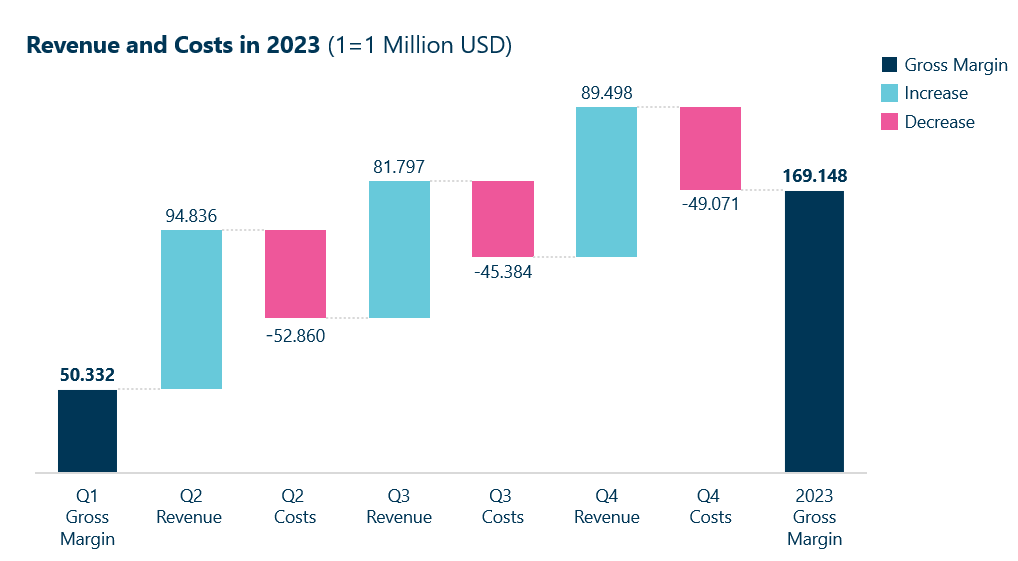
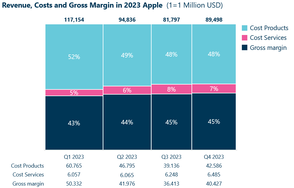
As seen by the Apple quarter revenue example shown before, the insight you get from this chart is rather different. Here you can see how much in percentage of revenue is cost each quarter.
Marimekko charts: Also known as Mekko charts or variable width bar charts. These charts add a third variable to a stacked bar. Here the width, height and area all give insight into the data. These charts are great at show proportion of a category on an overall whole.
By using the former Apple example, the width now provides us with the information on how much each quarter revenue represent of the entire year.
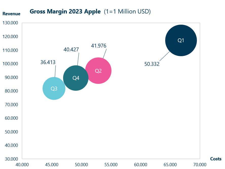
Bubble charts: A variation of a scatter chart where the data points are replaced with bubbles, which adds an extra dimension to the data in form of the size of the bubbles. Like in a scatter, a bubble chart has a horizontal axis and a vertical axis with values. These charts are better at showing trends than a waterfall chart.
If you have a waterfall chart showing cost and revenue but also want to include gross margin, then a bubble chart is better as it more clearly visualizes this additional dimension. In our Apple example it becomes even more clear that the first quarter is an outlier compared to looking at the Mekko chart.
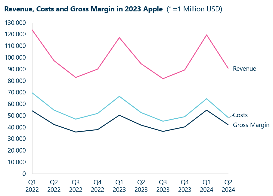
Line charts: Also known as line graphs uses data points connected by line segments to demonstrate a change of value. The horizontal axis depicts the progression continuously and the vertical axis show values of the metric of interest.
These charts are better as an indicator of prediction and is better at visualizing trends. If the changes are often or you want to show data over a longer timeframe then a line chart is more appropriate than a waterfall chart. A waterfall chart will be to complicated to follow.
With these charts you can see correlation with variables, here you can see that when revenue rise then costs and gross margin do as well.
Area charts: Very similar to line charts, but with a area filled below the line. It emphasizes the magnitude of values over a period of time. They are particularly great at showing cumulative data as well as trends.
If you have a waterfall chart about spend and revenue, but also want to demonstrate the cumulative impact over time, then these charts are more effective than a line or waterfall chart as it provides a clear visual representation of different segments contribute to the total.
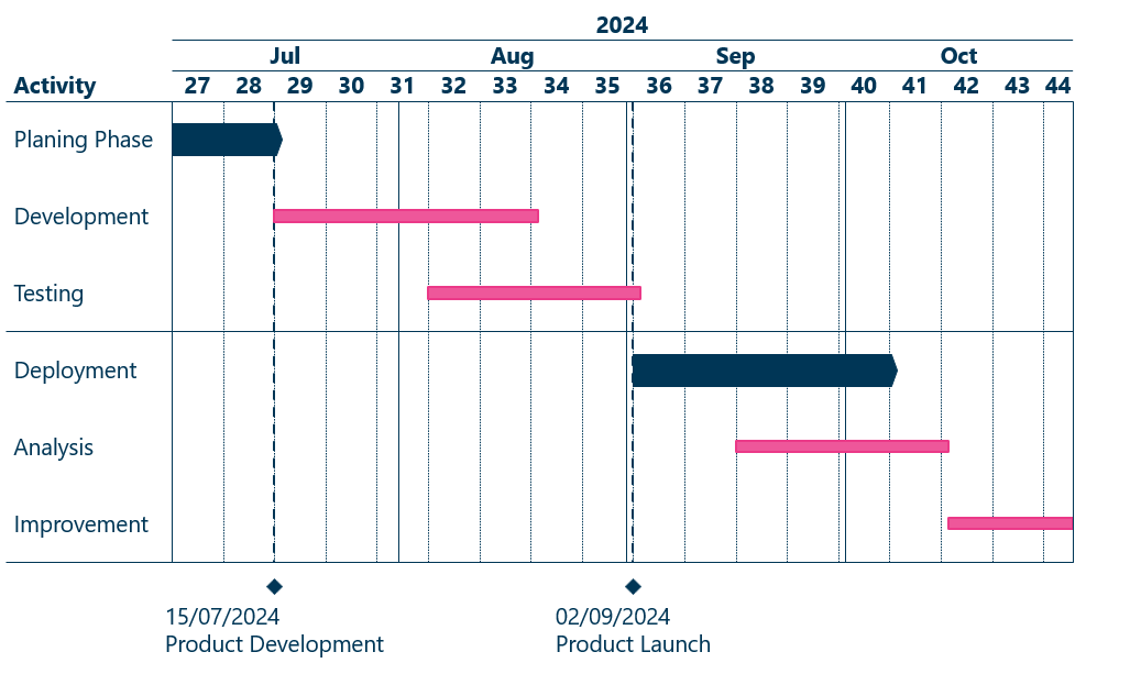
Gantt charts: Even know a waterfall chart can track the costs of a project, there is only one chart useful for a project timeline and that is the Gantt chart. It illustrates timelines and dependencies between tasks or activities and clearly show end dates, durations and the dependencies in a sequential format.
This list is not exhaustive but presented here are some of the most common charts to use instead of a waterfall chart. All these can also be created with Ampler Charts.
Amplify Your Waterfall Charts
Ampler is an amazing chart tool that can amplify your visualizations. You can for example easily add a y-axis, CAGR, connector lines, value line, total and level difference.
The y-axis helps with interpret the magnitude of the changes. Especially useful when there’s a great difference in the individual categories magnitude.
By adding a CAGR it’s becomes easier to dissect how the business has grown over a period of time
The same insight can be shown with a level difference or total difference instead
Seamlessly Connect to Excel Data
Ampler allows you to link your waterfall charts directly to Excel, ensuring that any updates to your data are reflected instantly in your presentation. This seamless integration saves hours of manual work, keeps your charts accurate, and allows you to manage complex financial or project data effortlessly. Whether you’re analyzing revenue flows, budgets, or resource allocation, Excel-linked charts make your workflow more efficient and error-free.
Expand Your Presentations with Gantt, Mekko, and More
Waterfall charts are just the beginning. With Ampler, you can create Gantt charts, Mekko charts, and a wide range of professional visualizations, all within the same PowerPoint workflow. This flexibility allows you to present complex data in multiple ways, whether for project management, financial analysis, or business consulting, without switching tools. You can quickly build polished charts that are consistent and presentation-ready.
Speed Up Workflow with Shortcuts and Agenda Functions
Save time and stay organized with Ampler’s productivity features. Shortcut functions let you insert, format, and update charts in seconds, while the agenda builder helps structure presentations efficiently. Combined with pre-formatted templates and consistent design standards, these tools streamline your workflow, letting you focus on insights and storytelling rather than manual formatting.
Conclusion: Waterfall Charts are a Wonderful Tool to depict Cumulative Effect
Waterfall charts or as sometimes called bridge charts are a powerful visualization tool to depict the cumulative outcome of sequentially positive and negative values. Particular they are effective in showing how a series intermediate values ultimately lead to a final value.
Widely used in financial analysis to show income components leading to net income or in project management to track timeline, resources and more. By their sequential nature they help to identify key areas of improvement or concern.
The visualization of columns that rise or fall makes it very clear to stakeholders the various impacts of factors leading to clear insights about the status of a project or financials of a company.
With Ampler, creating these charts is easy! Furthermore Ampler have many other chart options that can be generated with a few clicks! For more tips and information about features, click the links below.
How do I create waterfall charts in PowerPoint quickly?
Ampler allows you to create professional waterfall charts in minutes. Charts can be built directly in PowerPoint or linked to Excel for automatic updates.
What is Ampler Charts?
Ampler Charts is a PowerPoint Chart add-in for consultants. It enables you to create Gantt, Mekko, Waterfall, and all other consultant chart types.
Can I use Ampler for Gantt and Mekko charts too?
Yes, Ampler supports Gantt, Mekko, and other advanced charts, giving you a full toolkit for professional presentations.
Does Ampler support Excel-linked charts?
Absolutely. Excel-linked charts automatically update when your data changes, reducing manual adjustments and ensuring accurate presentations.
What productivity features does Ampler offer?
Shortcuts, agenda, library, Scan&Fix, align, and more make chart and slide creation faster and more consistent.
Is Ampler suitable for business presentations and consulting work?
Yes. Ampler is designed for professionals who need reliable, polished charts quickly. Waterfall, Gantt, and Mekko chart features make it ideal for consultants and analysts.
Do I need advanced Excel skills to benefit from Ampler?
No. While Excel linking is available, charts can also be created directly in PowerPoint with minimal effort.
Can Ampler help maintain consistent visual design?
Yes. All charts are professionally styled, and Ampler’s content library, extensive formatting features and customizability help maintain consistent presentation design.
This website uses cookies in order to improve the user experience. When you continue to use this site, you accept the use of cookies. Read more about our cookie policy here.