Intuitive Guide for Creating and Analyzing Scatter Plots
In this detailed guide, we will go through everything about using and creating scatter plots: How to make them, how to utilize them, and finally, how to interpret them. By the end of this guide, you will be able to create compelling scatter plots in both PowerPoint and Excel. Let’s start from the beginning!
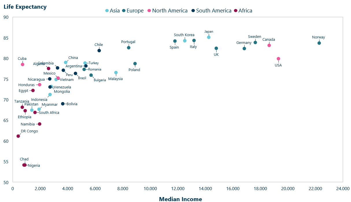
Scatter plot showing relationship between median income and life expectancy
What is a Scatter Plot?
A scatter plot, also sometimes referred to as a scatter chart or scatter graph, is a two-dimensional graph that visualizes the relationship between two variables. The plotting of numerical data points on a scatter plot documents how one variable affects another, making it an ideal tool for identifying correlations, patterns and clusters. A single dot on the chart corresponds with a single data point.
The independent variable, the one being controlled, is typically represented by the X-axis (horizontal axis), while the dependent variable, the one being tested, is represented by the Y-axis (vertical axis). The relationship between these two variables indicates whether there is positive, negative or no correlation at all. More on this later!
Scatter Plot Use Cases
There are many use cases for scatter plots. They are used in everything from finance, the social sciences to medicine. All you need to use them are two continues variables that you would like to analyze for an association between.
Let’s look at two examples.
Scatter Plot with a Few Data Entries
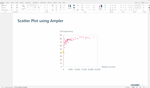
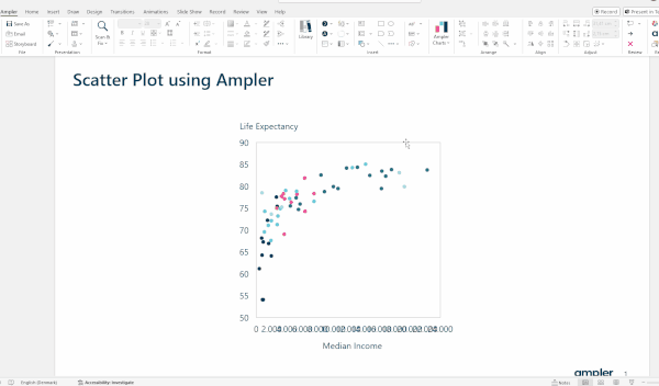
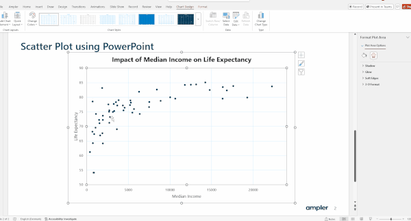
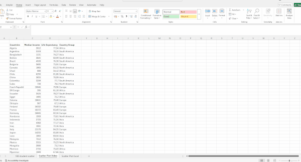
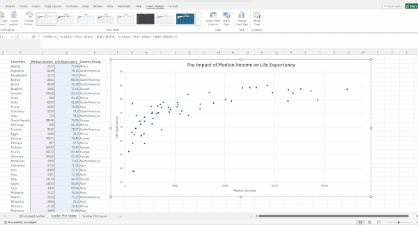
Let’s look at creating scatter plots with few data entries. The example evaluates the relationship between median income and life expectancy:
X-axis: Represents median household income in dollars
Y-axis: Represents life expectancy in years
Color indicates the continent
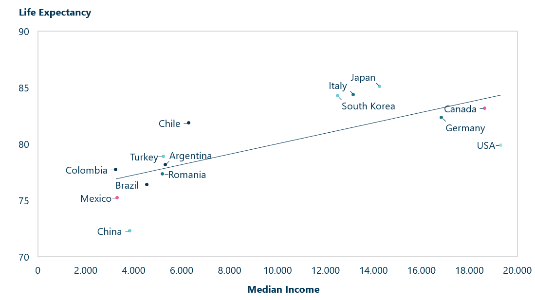
Scatter plot showing relationship between median income and life expectancy with a trendline showing positive correlation
As we can see, when we plot the data, there is a clear positive correlation between median income and life expectancy, meaning that as income increases, life expectancy also rises.
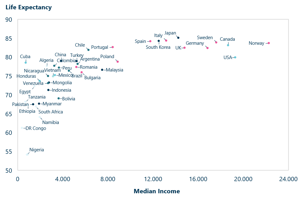
However, be cautious in assuming that this correlation will always remain linear even if we plot more data points. If we include nations that are either poorer or richer, than those in the first scatter plot, we notice a change. We can clearly see that the relationship change to follow a saturation curve, which means there is a significant rise at the beginning, followed by a leveling off at around $12,000.
Scatter plot with more data points
We can see that life expectancy rises sharply at first when median income rises, but only up to a certain point, as stated earlier. However, this does not confirm a causal relationship between the two variables – a scatter plot only visualizes the perceived relationship.
Also, remember you can only interpret the results within the scope of the available data. Never assume a true or universal relationship based solely on initial findings.
Creating Scatter Plots with Larger Datasets
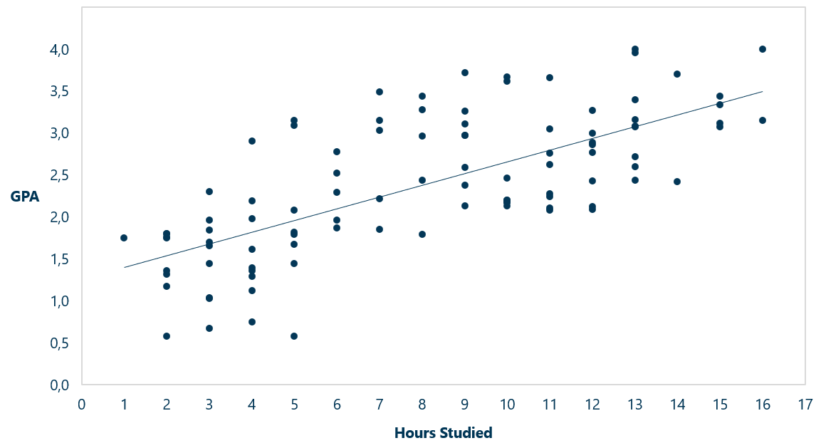
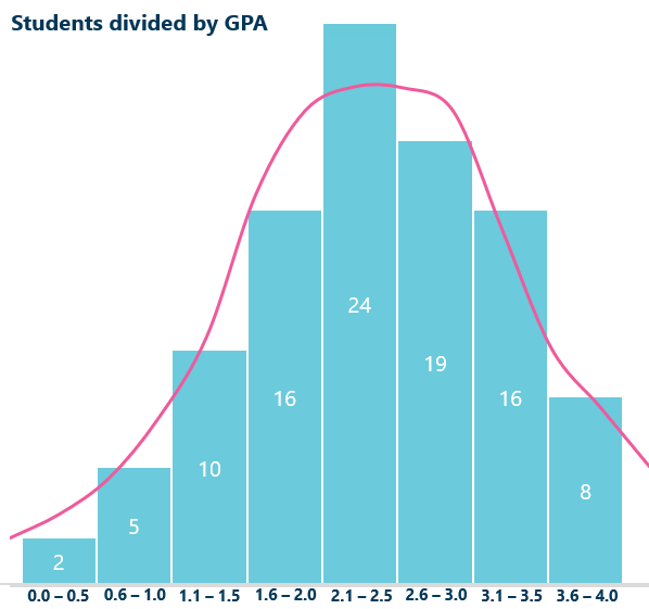
Now, lets turn another example with a larger dataset focusing on GPA scores among 100 students
X-axis: Indicates hours studied per week
Y-axis: Indicates their GPA scores (on a scale from 0.0 to 4.0)
Scatterplot showing 100 students and their GPA Score
If we add a trend line, the positive correlation between the two variables becomes clearer, it appears that the more hours studied, the higher the GPA score, and there could be a causal effect. However, be careful with this assumption – as the saying goes correlation does not equal causation. We will discuss this implication later.
How to Make a Scatter Plot in PowerPoint: Step-by-Step
Now, let’s get started by making a scatter plot. I will use Ampler Charts in the main guide, but you should still follow these steps, as they don’t deviate much, whether you use an add-in or not. After the main guide I will show you how to make scatter plots in PowerPoint and Excel without any add-ons!
Watch the video or read through the guide below to learn how to create an effective scatter plot:
Step 1: Double-Check Your Data
To determine if a scatter plot is suitable for your data, ensure you have two continuous variables and the aim is to analyze the pattern and relationship between them (how the independent variable, X affects the dependent variable, Y)
Make sure you check for outliers. Check if they aren’t due to a measurement error, remove them if they are. If not, you need to evaluate if you should include them as they can distort the correlation significantly.
Step 2: Insert the Chart
In the main guide, we will as mentioned, use Ampler, but still follow along these steps, as they are helpful no matter what you use. After the main guide we will go over how to do it in PowerPoint and Excel without add-ons.
To insert scatter plot using Ampler, simply plot it in the following way:
Click on the Ampler ribbon
Click on Ampler Charts
Choose X Y (scatter plot) and insert in PowerPoint
Insert Scatter Plot Ampler (GIF)
Step 3: Input Data Points on the Horizontal Axis and the Vertical Axis
To plot in your data, do the following:
Double-click on the chart to open the dataset
While the table is open, plot in the data (You can also just establish an Excel link)
If you want to change a single data point, simply type change it in the sheet
Rename the axes by changing the column headings
Insert data scatter plot Ampler (GIF)
Tip: You can turn the scatter chart into a bubble chart by inserting data into the size column in the data table
Step 4: Customize the Scatter Plot to Suit Your Needs
After plotting in your data, it’s time to customize your chart:
Scale the axes’ number format to match the data values
Scale the dots up to make them more visible
Add a fourth categorical variable by using the “Group” section in the data table
Customize scatter plot Ampler (GIF)
Step 5: Finalize the Scatter Plot!
Now, let’s finalize your chart! Make sure to only include necessary information. Add and tweak the following:
Scale the chart so all the data points can be seen clearly
Toggle on/off text labels
Add a title to clarify the context that the chart shows
There you have it – a great scatter plot!
Finalize scatter plot Ampler (GIF)
Let’s now turn to how to aproach creating scatter plots in native PowerPoint and Excel.
Creating Scatter Plots in PowerPoint Without Add-Ins
Creating a bubble chart in native PowerPoint is more tedious, but it can be done, but with some limitations:
Click on the “Insert” tab and choose “Charts”
Under “X Y (scatter)” choose “Bubble”
Scale the axes by clicking on them and typing in your desired scale
Add Axis Titles by clicking the plus icon and selecting it from the menu
Write a chart title to clarify the context
Remember to change the color of the titles and axes, as well as the font size
Insert Scatter Plot PowerPoint (GIF)
Now let’s customize it some more:
Resize the dots by first clicking on them. Under “Marker”, scale the width
To add text labels, go to “Add Chart Element” under “Chart Design” and select “More Options”. Toggle it on. You will have to write the dot name manually!
To add dots in a group, you can format them. However, in our example, it won’t work do to them having overlapping X and Y values. You will have to change the color manually!
Finalize scatter plot PowerPoint (GIF)
There you have it a scatter plot in PowerPoint
Creating Scatter Plots in Excel
If you however want to make a scatter plot in Excel, follow these steps:
Highlight the two numeric variables, then go to the “Insert” tab and insert “X Y Scatter”
To Scale the axes, click on the axis and select “Format Axis”, and then write the minimum and maximum bounds.
To add axis title click on “Chart Options” and toggle on axis titles.
Give the chart a title to clarify the context of the chart
Insert Scatter Plot Excel (GIF)
Now, let’s customize the chart some more:
To change the color of the dots to add a categorical variable, you can use conditional formatting or color them one by one (this needs to be done in our case, because it isn’t based on values but category: Region)
To label individual dots, click on “Add Chart Element” and select “Data Labels”.
You add a trend line under “Add Chart Element” as well
Finalize Scatter Plot Excel (GIF)
Just like that! A scatter plot in Excel!
Scatter Plot Best Practices
When creating scatter plots, there are some guidelines you can follow in order to showcase your data effectively and avoid pitfalls:
Ensure that both variables are continuous, meaning they have numerical values. Categorical data variables aren’t suitable
Make sure to include axis labels and label key data points directly if it amplifies interpretation. Be mindful of clutter.
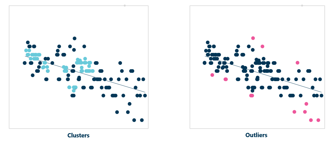
Highlight clusters and outliers for example, with color. Be aware outliers can distort the correlation and you may need to decide whether to remove extreme outliers.
Use appropriate scaling for axes to capture the whole pattern
Add a trend line to show the best fit for the correlation direction
How to Analyze a Scatter Plot
When analyzing data using a scatter plot, there are some key aspects to consider:
First look at the overall pattern. Does the data follow a straight line, or does it curve?
Determine the direction is the relationship? Is it positive, negative, or no clear pattern at all?
Assess the spread of the data points. Are they clustered closely together, or are they widely scattered?
Identify outliers. Are there points that don’t fit the pattern? What might these data points indicate? Why do they deviate from the main trend?
Are there points that don’t fit the pattern? What does this indicate about these data points? Why do they deviate from the main pattern?
Calculate the correlation coefficient. This metric can help quantify the strength and direction of the relationship.
Let’s look explore some of these concepts in more detail
Outliers and Clusters in Scatter Plots
When analyzing scatter plots, outliers and clusters are specially important.
Outliers are data points that lie outside the observed pattern. They may indicate measurement errors or special cases that require further investigation. There could be a reason for these anomalies that reveal new insights in your data. However, be cautious – outliers can bias correlation and regression models.
Clusters are groups of data points that are very close to each other in y and x values. They cluster around each other, hence the name. These distinct subpopulations may indicate a special association between these data points. Analyzing clusters can help highlight common characteristics among these data points that could reveal interesting insights.
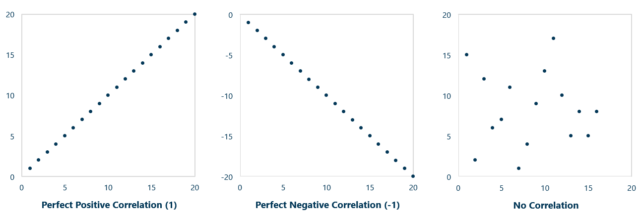
The Pearson correlation coefficient is a key statistical concept that measure the strength and direction of a linear relationship between two variables. It ranges from a scale from -1 to 1.
If the coefficient is 1 it means:
That when one variable increase – the other variable also increase proportionally in the same direction
The data points lie perfectly on a straight line with a positive slope when plotted on a scatter plot
There is perfect positive correlation meaning the relationship is completely linear with no deviation from the trend
If the coefficient is 0 it means:
There is no linear relationship whatsoever between the variables
There is no consistent pattern that allows you to predict the value of one variable based on the other
A perfect positive correlation, a perfect negative correlation, and a scatter plot with no correlation
Remember three important things people often forget:
The relationship is rarely 0 or 1 when using real data
If the coefficient is -1, it indicates a perfect negative correlation – the two variables move proportionally in the opposite direction. As one variable decreases, the other variable increase.
If the coefficient is 0, there is no apparent relationship; it can however be a non-linear one
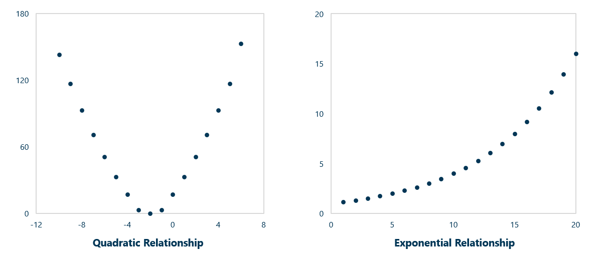
While correlation coefficients are an effective tool for measuring the relationships between two variables’ relative movements. It does not tell us anything about causation as variables may be influenced by other factors not accounted for. The measure is also very sensitive to outliers, even a single outlier can distort the significantly data.
Non-linear relationships
To measure causality, you would use statistical methods like regression models, randomized controlled trials or causal inference techniques. For outliers, look at metrics such as variance, standard deviations or Z-scores. You can also highlight outliers graphically by creating scatter plots.
Calculating a Correlation Coefficient
While creating scatter plots provide a visual representation of the individual data points, it can be hard to determine how strong the linear correlation is, this can however be calculated.
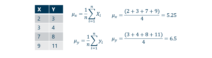
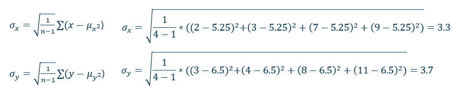
Calculating the correlation coefficient by hand can be difficult, therefor let’s look at a simple example where we have the four values of X and Y.
First step to calculate the correlation coefficient is to find the mean of X and Y with the following formula. It looks a bit complicated, but all you need to do is to add the values from the dependent variable (X) and divide with the amount of values. Do the same with the independent variable (Y).
Then we get 5.25 for X and 6.5 for Y.
The next step is to calculate the squared deviation for each value and then sum them. For X, the sum of squared deviations is 32.75. This value need to be divided by the degrees of freedom, which is the number of observations minus 1.
Since there is 4 observations, we divide 32.75 with 3 getting 10.9197
Then we need to take the square root of this value, that gives us the standard deviation, a measure of how spread the values are from the mean. As you can see below the standard deviation for X is 3.3
Repeat the same process for Y to find its standard deviation.
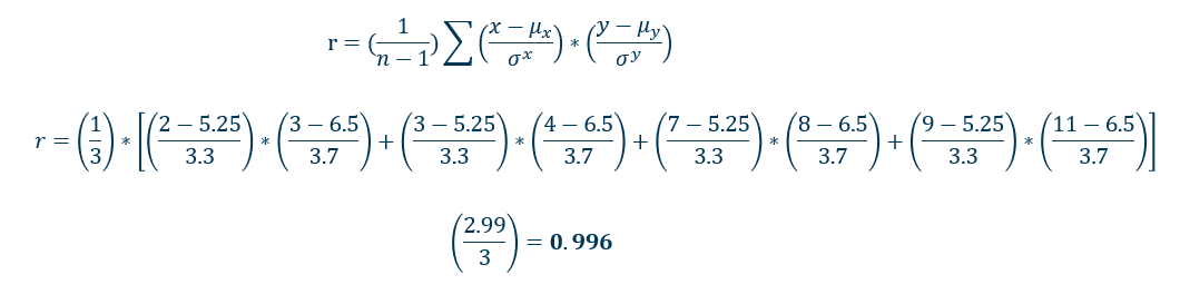
Then standardize each value of X and Y by subtracting the mean and divide by standard deviation. This gives the product of scandalized values for each pair of X and Y. Then calculate the sum of these products and the multiply with the factor, where n is the number of data points.
Here we finally get a correlation coefficient of 0.996.
We get a near perfect positive linear correlation as the value is close to 1. The correlation coefficient can be added to your chart to clarify, how linear the correlation is as this can be hard to detect by the naked eye.
With large data sets it can be hard to calculate the coefficient in hand. Thankfully, some calculators provide the correlation coefficient directly, and statistical software like R can compute it using: Cor()
Remember the calculation only applies to linear correlation and does not imply causality. If the number is close to 0 it may indicate a non-linear relationship.
To test a hypothesis, for example that median income leads to higher life expectancy and that it’s highly unlikely the data points gathered are due to chance, we would need to perform a regression and calculate the R-squared value, which is out of scope for this article.
Alternatives to Scatter Plots
While scatter plots are excellent for showing relationships between two continuous variables, they don’t show the probability of getting a certain value, and the distribution of values can also be hard to decipher. Further, they are limited to two variables. Always determine what you want to convey to your audience.
Some alternatives include histograms, bubble charts, cell plots and line charts. In the following section, we will look at two types and alleviate the problems we mentioned.
Density Plot with Histogram
A density plot is a smooth curve that shows how the data is distributed. It estimates the density of data values and is helpful for visualizing probabilities. Density plots are beneficial to use instead of a scatter plot, when you have to many data points, or want to highlight the probability of getting a certain value and show the distribution of the data. The curve sums up to 1.
If we use our former example with 100 students and their GPA scores, we can see that there is a high probability of getting a score between 1.7 and 3. On the other hand, there is a low probability of getting a score between 3.7 – 4 and 0 – 1. The curve flattens as the probability gets closer to 0.
Note we have simplified and made put scores in intervals un order to make the chart more simple to understand. The histogram show the amount student in each interval
Example of a density plot showing GPA grade for 100 students
The curve forms a skewed distribution, close to what in statistics is referred to as a normal distribution or a bell curve, which indicates that the majority of students get a GPA grade close to the mean and that top and low-performing students are outliers.
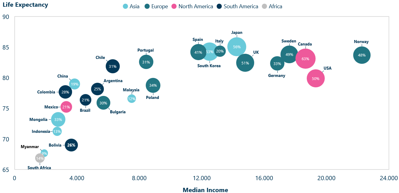
Bubble Chart
A bubble chart is an extension of a scatter plot with three variables instead of two. This allows for an additional numeric variable. Instead of dots, the data points are bubbles. The size of each bubble corresponds to the value of the third numeric variable.
The bubbles add a third dimension to your data and allow you to compare three pairwise relationships, as well as the overall association between all three variables. If you wanted to do the same with scatter plots, you would need pairwise scatter plots to analyze the relationships between each pair of variables separately. This approach is often called a scatter plot matrix, where multiple scatter plots are arranged in a matrix format to visualize all pairwise relationships between variables.
In a bubble you can also add a fourth variable by coloring the bubble. This variable as in our example can be categorical.
If we look at the previous example comparing life expectancy and median income, but add the percentage of college degrees in each country, we can see that countries with higher life expectancy and income often have more people with college degrees. However, Italy and Germany are outliers. Although they have a high life expectancy and income, they have a low percentage of college degrees.
Bubble chart showing countries compared on median income, life expectancy and % of college degrees
Conclusion: Scatter Plots are Effective in Visualizing Relationships Through Data
Scatter plots are a powerful visualization tool and a mainstay in statistics, due to their ability to identify correlations, clusters, and outliers. Their simplicity is their strength, which allows for plotting thousands of data points, something other chart types can’t possibly do without becoming unreadable Further, the degree of linear association can be inferred as well as if this association is positive or negative.
However, if there are too many data points, it can be hard to interpret the quantity of entries. By using a density plot, the probability of values can be shown and the distribution can be visualized. With a bubble chart, you can incorporate a third variable, but there is an issue with cluttering because of the points added surface.
At last, a scatter plot a great start to visualize, examine, and analyze data, but you can’t conclude there is any causality. To infer this, you would have to use statistical methods like regression models or caused inference techniques.
Ampler is more than just a chart and scatter plot maker it’s a full on productivity tool for the entire Office package. For more information, visit our web page: Ampler.io
This website uses cookies in order to improve the user experience. When you continue to use this site, you accept the use of cookies. Read more about our cookie policy here.