In this detailed guide, we will go through everything about Gantt charts, how to create them in PowerPoint or Excel, and how to use them effectively for complex projects.
You don’t have to be a project manager or a project management consultant to use Gantt charts; they are useful for about everyone and for almost any kind of project. Let’s start with the basics: What is a Gantt chart?
The Gantt chart was first popularized by American mechanical engineer and management consultant Henry Gantt in the 1910s. It was famously used under a world-renowned construction project: The Hoover Dam.
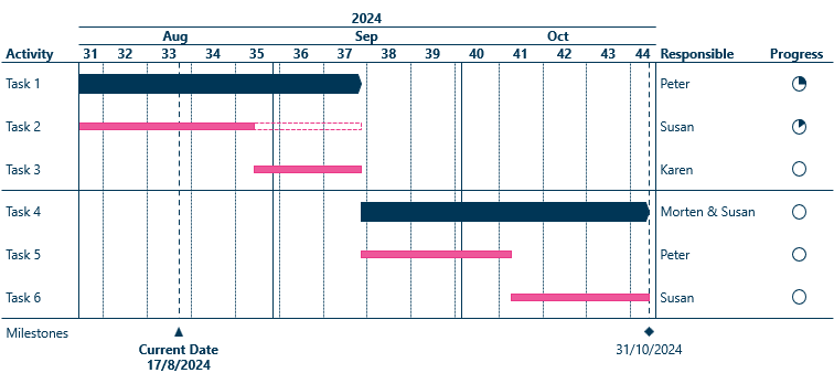
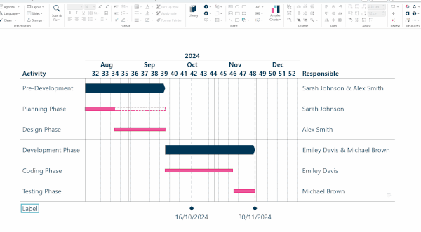
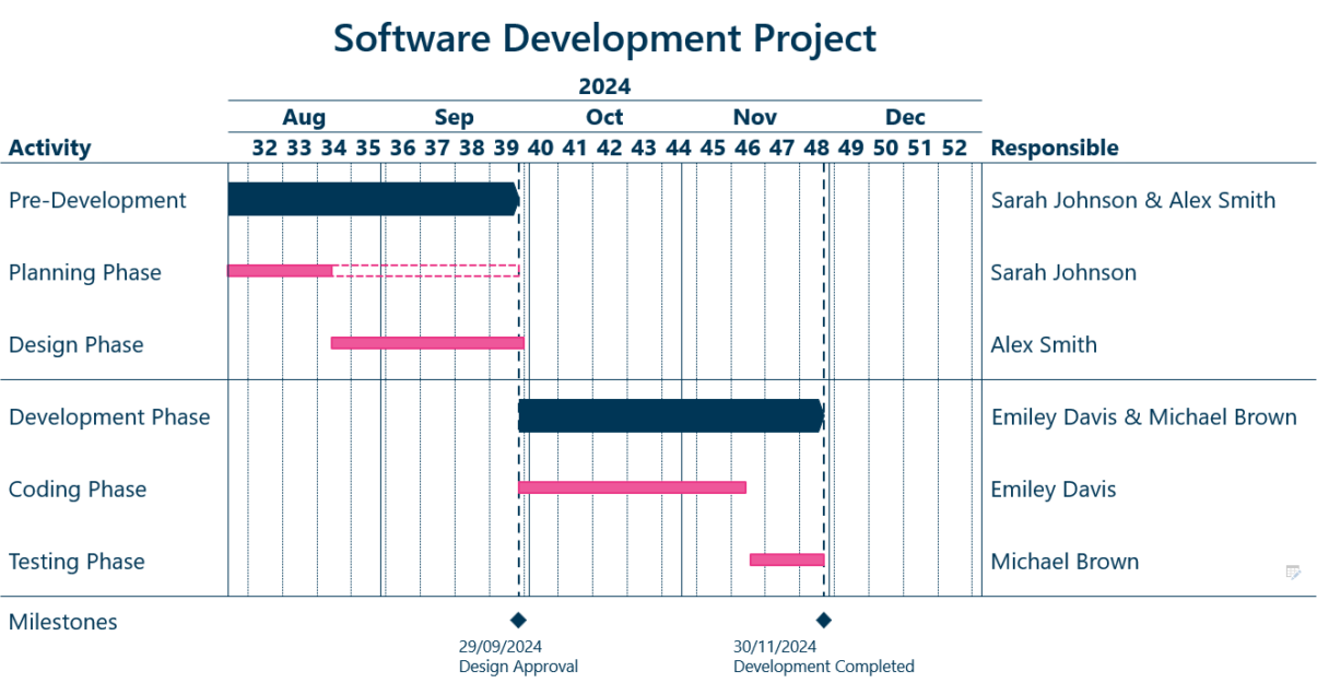
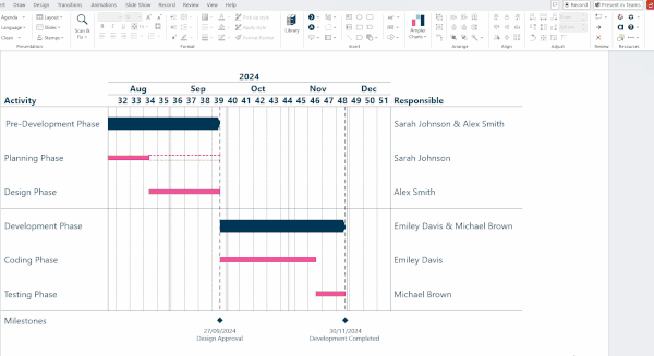
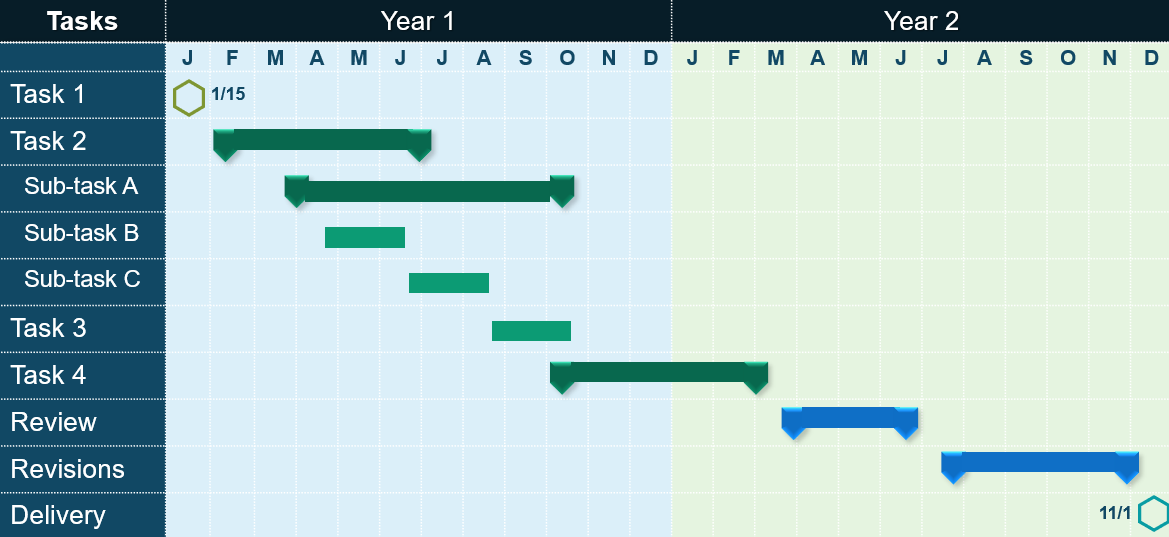
A Gantt chart is a project scheduling tool in the form of a horizontal bar chart that shows the visual timeline of a project schedule helping to track a project’s progress. It encompasses a timeline of tasks horizontally and the status of each task at the end of the chart vertically. Some also show who is responsible for the individual tasks of the project.
To break it down further, Gantt charts contain multiple elements, that makes them arguably the best project management tool of all. Here is a quick rundown:
Sometimes, they also include a budget making them a useful financial tool as well.
This is the reason for its continued popularity in the 21st century, as it allows project managers to monitor progress, assign tasks and track schedules in complex projects. As a result, Gantt charts have become one of the most frequently used project management tools in the world.
Let’s turn to the individual components that make up the Gantt chart:
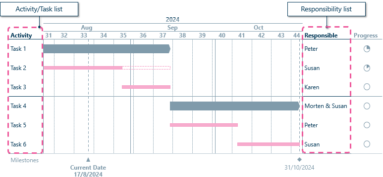
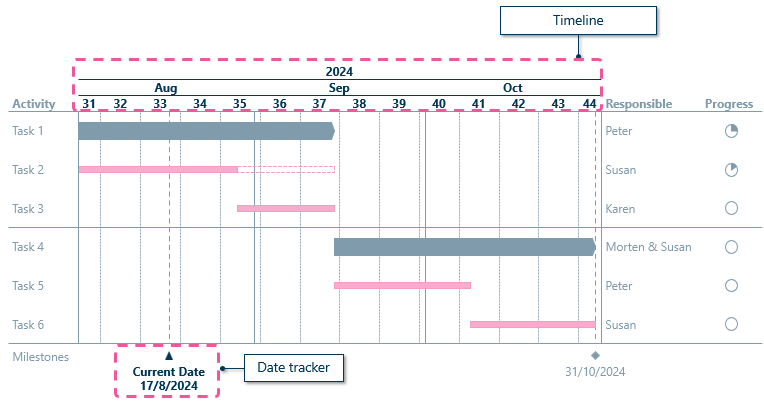
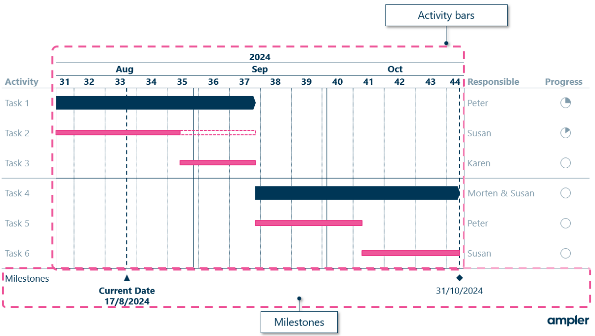
You can also link to project documents under the responsibility column if needed.
Now that we have covered what a Gantt chart is, what it contains and why it’s useful, let’s explore some use cases!
Projects come in many forms and Gantt charts can be applied in a variety of ways and in lots of different fields. The following Gantt chart are just some of the potential use cases for this incredible tool, serving as inspiration for your own projects. Simply put, if you have a project, a Gantt chart can be useful!
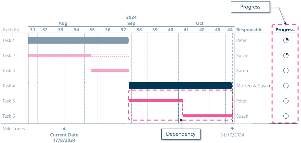
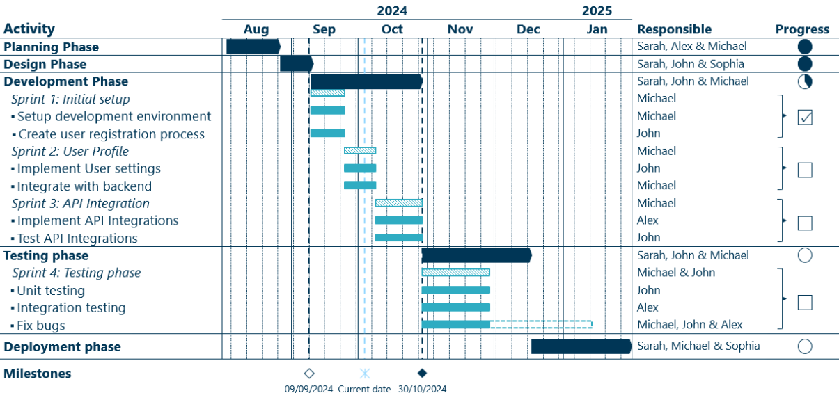
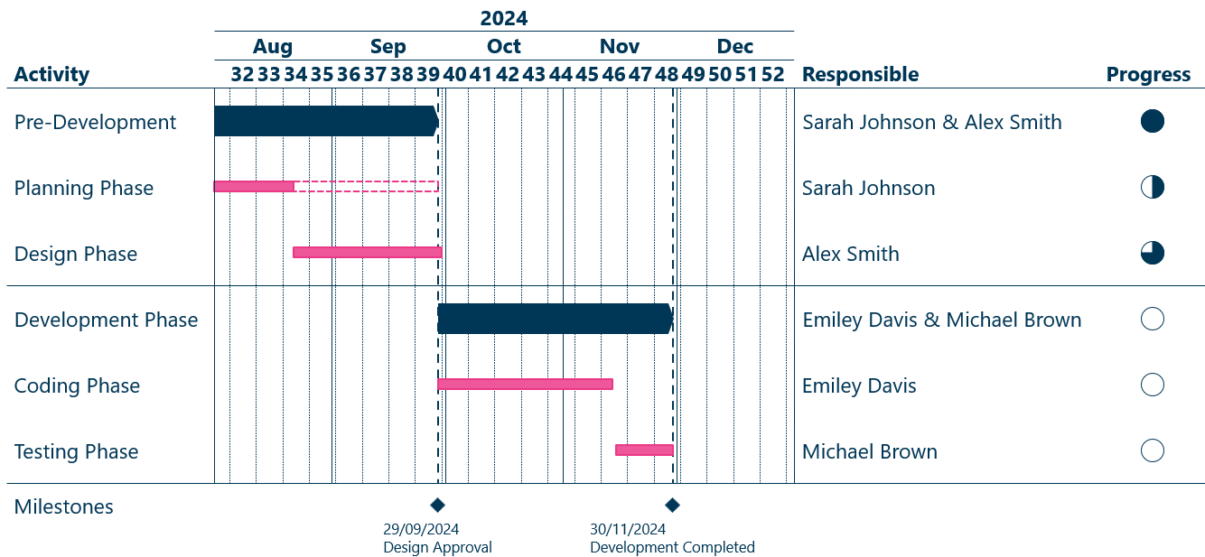
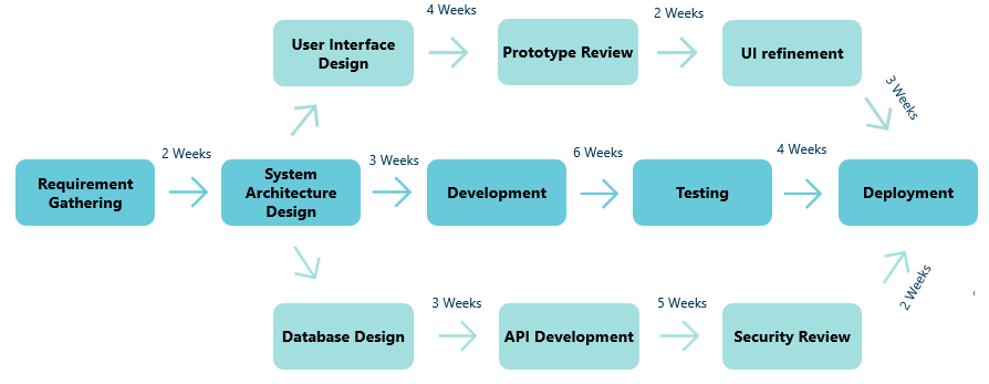
These types of projects are heavy reliant on dependent tasks. For example, you can’t test for functionality before the staging environment is set up, creating what is known as a finish-to-start dependency, which means a successor task depends on the completion of a previous one.
In software development, it’s common to have short time periods (usually 2-4 weeks) in which a specific set of work must be completed, these are called sprints and are common in agile projects, here they are shown with diagonal lined bars. The overall phases are shown in dark blue and the lesser tasks with light blue.
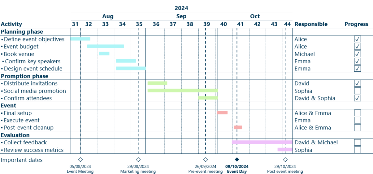
Our next Gantt chart example is a classic one: The planning of an event. Events often don’t have many dependencies, but do have a lot of deadlines, meetings and decisions. Meetings and decisions can be highlighted by icons, annotations or other chart elements.
Typically, an event follows this formula: Planning, promotion, the event itself and evaluation. Here it’s a common practice to group tasks into these phases and color code the Gantt chart bars for clear identification.
Another classic use of a Gantt chart is a marketing campaign. Modern marketing campaigns often have lots of moving parts happening simultaneously or in succession. A good approach is to group the individual tasks together into subcategories by the type of marketing activity, rather than their position on the timeline, unlike the event planning Gantt chart.
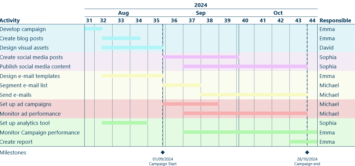
A product launch Gantt chart often include specific milestones like: Launch day, campaign start etc.
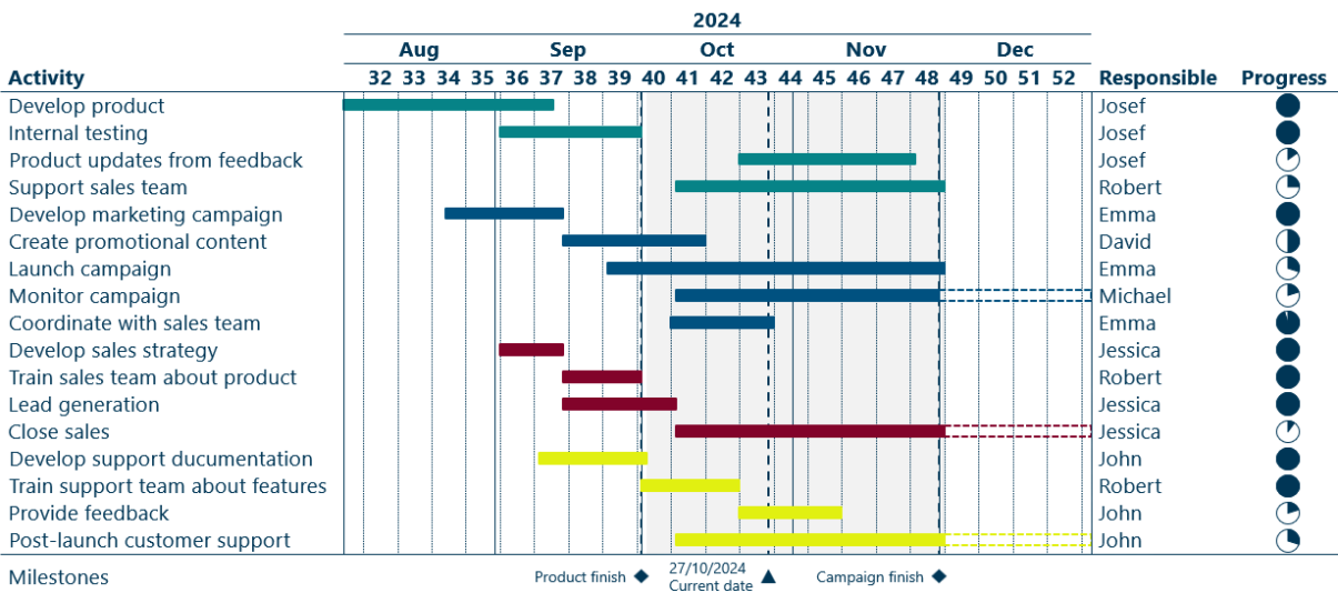
Unlike a software development or a marketing Gantt chart they feature coordination between various departments, such as marketing, customer support, sales and product development. Therefore, this kind of a Gantt chart are a great example of how different departments interlink and collaborate. It also highlights how a Gantt chart serves as an excellent management tool for tracking the responsibilities of individual teams. In this example the crucial launch period is shaded to emphasize the importance of this period of the project.
If you have more projects running simultaneously, a Gantt chart that displays all the projects in one view can be ideal for ensuring deadlines are met. It’s extremely important that these projects are easy to distinctive, so the tasks don’t get mixed up.
There are several ways to prevent confusion. For example, you can assign different color schemes to each project and include a legend to explain the color coding. Using distinct milestones symbols for each project can also helps. If the Gantt chart software supports filters it can be useful to group tasks by project.
As seen on the following example, adding comments can help give a overview of the state of the tasks.
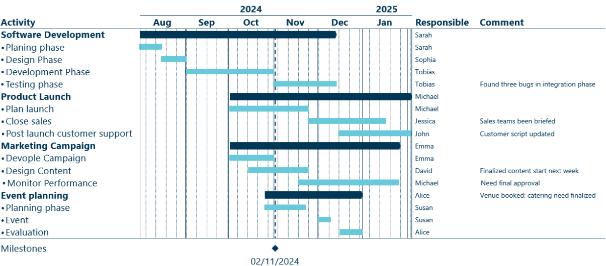
However, if there are to many projects simultaneously it could be a better option to split them up into their own separate Gantt charts. The multiple projects Gantt chart do however show how individual project teams are assigned.
Now that we’ve explored multiple examples of what Gantt charts can be used for, it’s time to show you what you’re looking for – how to create them.
There are many tools for creating Gantt charts including PowerPoint’s native Gantt chart template or a bar chart in Excel formatted to a Gantt chart. We will cover these methods later, but first we’ll use Ampler, as it’s one of the best chart tools on the market.
Regardless of which add-in you use, the steps are more less the same, so this guide will be useful in any case. Watch the video below or read through the step-by-step guide to learn how you can create your own gorgeous Gantt chart.
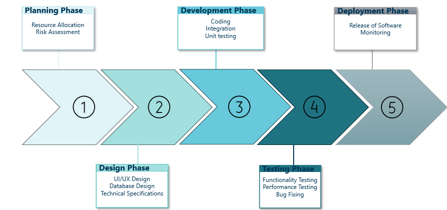
The Gantt chart is one of the one of the most widely used project scheduling tool for project managers. It is useful for almost any type of project that involves more complexity than a simple to-do list. You should consider using a Gantt chart if your project has a deadline, involves multiple teams or individuals, and contains a significant level of complexity.
However, there are instances where Gantt chars may not be suitable. For example, iterative projects can be challenging to adapt to a Gantt chart as they are not linear by nature. Other examples include a simple project where a checklist suffices, projects with high agility where tasks and priorities change frequently, or projects where the focus is on creativity and more important than meeting deadlines.
In Ampler to create Gantt charts is straightforward:
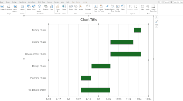
A Gantt chart will instantly appear with a predetermined project timeline, activities, bars and milestones. All of these elements can easily be customized to fit your preferred look and project timeline, as we will cover in the following steps.
In Ampler there are multiple ways to set up your project timeline, you can for example:
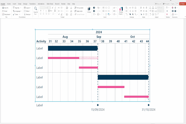
Want to add more tasks, bars, milestones etc.? Right click and select the plus icon to add. The chart adds them instantly.
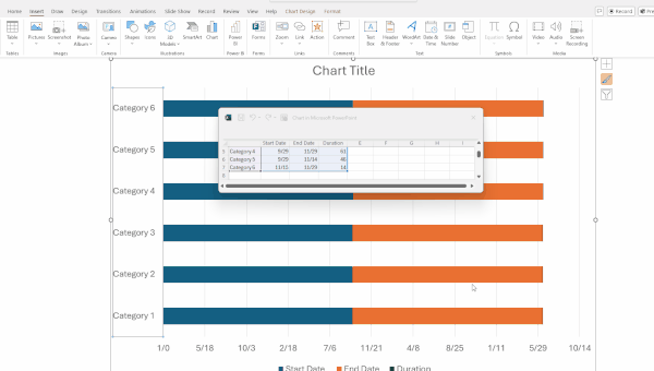
If you already have a pre-made Excel spreadsheet with dates and durations, you can right click on the Ampler Gantt chart and choose “Establish Excel Link”. A separate window will open where you highlight the data range. Once you return to PowerPoint, the Gantt chart change to fit the new data.
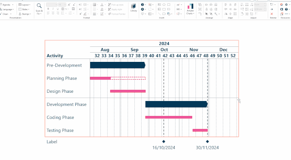
Not only can you change the start and end dates or the type of bars, but everything on the Gantt chart can be customized to align with your corporate branding or personal preferences. If you’re not using an add-in like Ampler, some of these customizations needs to be done manually. Also not all tools may offer the same options as Ampler.
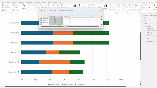
In Ampler you can easily create a task list and adjust all dates at once by right clicking the Gantt chart and selecting the Excel button. An Excel spreadsheet will appear, allowing you to modify the start dates, end dates, names of the project tasks, bar types, and their levels on the Gantt chart:
You can Toggle on/off responsibility list the following way:
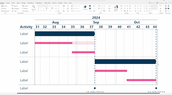
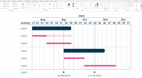
To change milestones dates, you can drag them on the chart:
Now that you’ve created a Gantt chart, Ampler also offers several additional features to enhance your charts:
Tip: To monitor progress, you can insert Harvey Balls in the comments section. For more on Harvey Balls, read this article: How to Use Harvey Balls
Now that we’ve customized our Gantt chart to our preferences, there are just a few minor details to finalize:
it’s also possible to save both the chart theme and/or chart layout to your library or organization, making them accessible for future use.
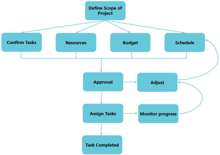
Once you’ve created your Gantt chart with your chosen project management software, the work isn’t over! While the plan can be crystal clear, anyone who has followed one knows it rarely goes exactly as expected. Everything from production schedules to budgets can change.
Therefore, be sure to track the progress of tasks, modify the budget, adjust the plan, and re-assign tasks as needed based on the actual progress of the project.
Now that we have gone through the basic guide of how to make a Gantt chart, while simultaneously using an add-in like Ampler, we’ll now show you how to make Gantt charts in PowerPoint and Excel, without using add-ins. While it’s possible, we don’t recommend it, as it can be time-consuming and lack visual appeal.
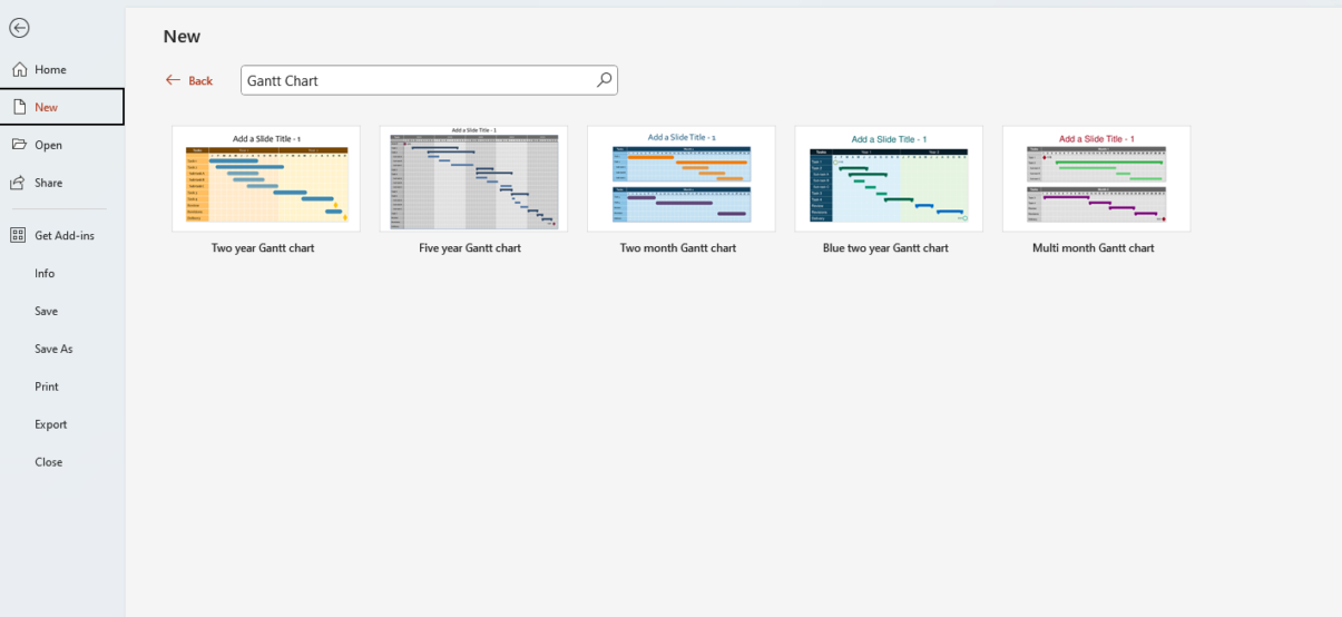
PowerPoint offers their own Gantt Chart templates. To use them, you have to do the following:
After choosing your Gantt chart template: Edit the tasks and timeline (weeks, months or years). You will see icons in the top-left and bottom-right corners representing the start and end dates. Edit them by clicking on the icons and enter the relevant dates.
You can adjust the length of the bars by simply clicking on them and drag to adjust. The start and end dates of the timeline can also be dragged this way.
To change the colors, click the object and choose shape fill in the format tab. You can also customize the outlines and apply shape effects.
If you prefer to create your own PowerPoint Gantt chart instead of using the native templates, follow these steps:
A chart with a associated data table will appear. Adjust the columns to fit your project by renaming them to Task, Start Date and Duration. Then enter your project tasks, start dates and durations in corresponding cells.
To make sure you have the right number format:
In a Gantt chart, the duration of tasks are essential. To adjust the bars to make it fit the duration you need to make a formula ($C2-$B2 in cell D2) as shown:
The chart still contains colored bars for the start dates and end dates. To remove the end dates:
Now, remove the fill color of the blue bars by selecting them and choosing “No Fill”. The remaining bars now represent the tasks duration. However. the Gantt chart is still in reverse order to change this:
There you have it – a Gantt chart in PowerPoint! You can add dependency lines and change the color of the bars as needed.
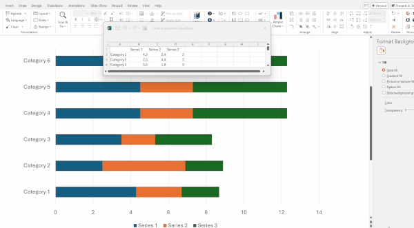
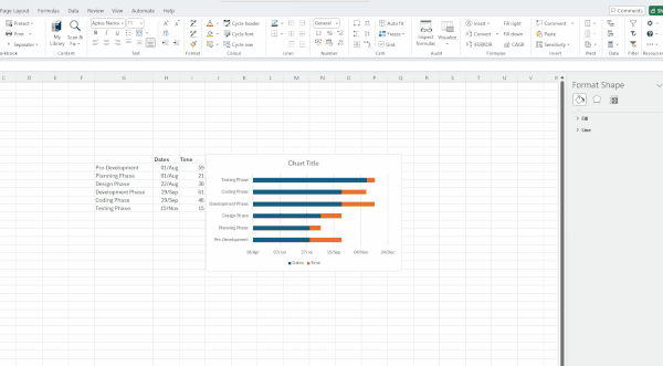
You can also create a Gantt chart in Excel by using a stacked bar chart in the following way:
The chart will initially be shown in reverse order. To change this, highlight the categories on the vertical axis. Select “Format Axis”, scroll down and check the box for: “Categories in Reverse Order”.
Now let’s make it look like a Gantt chart:
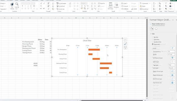
After this, only the task bars will be displayed on the Gantt chart. To add gridlines:
There you have it, a Gantt chart in Excel!
While it’s possible to create a Gantt chart in Excel and PowerPoint, these platforms are not as visually appealing or intuitive to use compared to an add-in like Ampler. Ampler is faster and more advanced for creating effective Gantt charts. If you regularly use Gantt charts in a professional setting, it’s recommended to use an add-in for enhanced efficiency and functionality.
When you have created your Gantt chart, that are some guidelines to ensure, that you have created a effective chart:
Tip: You can also color-code individuals or teams on your Gantt chart to clearly show who is responsible for each task.
Throughout this article, we have highlighted all the benefits of Gantt charts, but there are also some disadvantages to consider:
In good order let’s highlight the advantages of Gantt charts
As we have mentioned Gantt charts aren’t the best option for the following: Iterative projects, agile projects and projects with focus on creativity. Let’s explain why:
An iterative project is a project where tasks are repeated in cycles, unlike a traditional project schedule where tasks are completed once and for all. The circular nature of these projects are better visualized and manage by other project management tools.
Agile projects can be difficult to track in a Gantt chart due to their emphasis on flexibility and adaptability in small, iterative cycles. In agile methodologies, deliverables are the primary success factor, while deadlines are secondary. Additionally, agile teams typically have a high degree of autonomy, making the oversight project management style of a Gantt chart less effective.
When a project’s focus is on creativity and innovative ideas, it often combines elements of both iterative and agile work structures. These projects do not adhere to preset deadlines. Instead, success is determined by inventiveness of the deliverables from the project team. Note however that traditional projects can include phases focused on creativity.
Now let’s turn to some alternatives for managing projects these kinds of projects, that project managers can use instead of Gantt charts.
There are several project management tools that can be used alongside or instead of Gantt Charts for various types of projects, including agile, iterative or creativity-focused ones. Some of these tools can be used in specific phases of a traditional project or as a complement to Gantt charts. The following is a non-exhaustive list of alternatives:
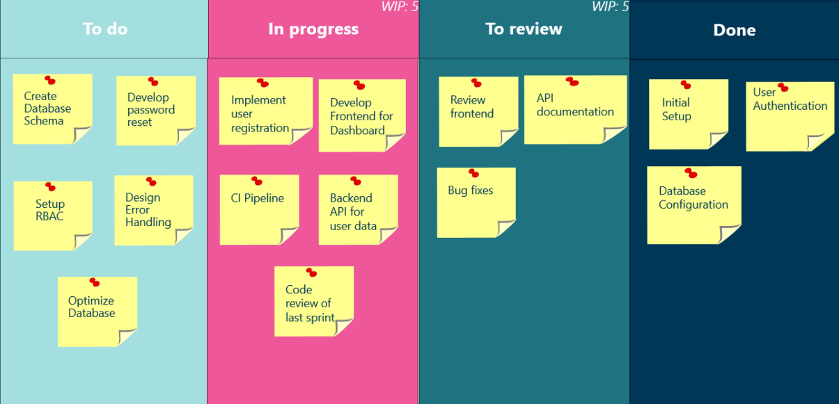
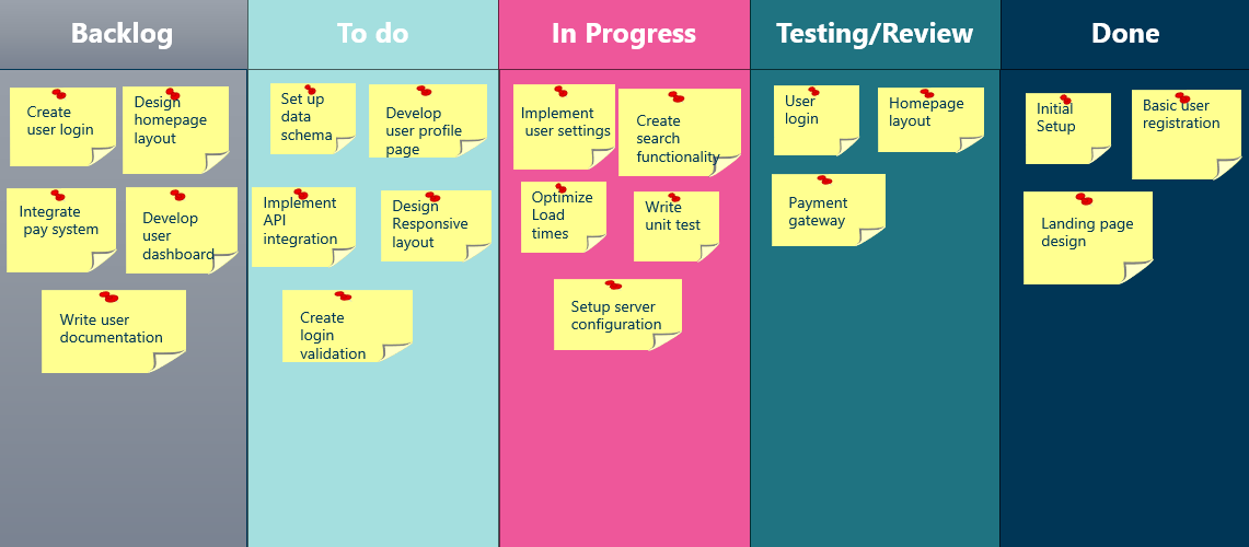
A Kanban Board is a management tool that represents workflow of tasks. It uses columns and cards to display tasks, with columns representing different stages such as: “To Do,” “In Progress,” and “Done.” The cards represent the individual task and include relevant details.
The Work-in-Progress (WIP) limits set the maximum number of tasks allowed in each column or stage which helps prevent overloading. They can include Swimlanes which horizontal rows that separate work or teams within the project.
Kanban Boards are more flexible than a Gantt Chart making them ideal for iterative projects. They are also simpler visually.
A Scrum Board is a project management tool designed to support agile methodologies and projects, often used in sprints – a short period of time typically ranging from one to two weeks. The main point of a Scrum Board is to help project teams focus on a limited number of tasks at any given time. The board is divided into columns such as “To Do,” “In Progress,” “In Review,” and “Done.” Tasks move horizontally across these columns until they are marked as “Done”. Tasks that are not currently being worked on are kept in the Scrum backlog, out of focus for the time being.
While Gantt charts provide a structured and detailed plan (with some flexibility), Scrum boards enable teams to adapt quickly to change and obstacles. This makes them particularly effective for iterative work, where the team cycles through the same processes repeatedly.
A timeline chart is a simpler form of project management tool that focuses on the main tasks, milestones and events. It provides an overall roadmap of the project without subdividing the project into detailed tasks. The boarder overview highlights essential information without overwhelming stakeholders with minor details. This makes timeline charts are an excellent choice for presenting to stakeholders, as they convey the overall project timeline clearly and concisely.
A PERT chart, or Program Evaluation Review Technique, is a project management tool that allows project managers to schedule a project by providing an overview of the dependent tasks and project timeline. The chart use nodes (often represented by rectangles) to signify milestones, which are connected by arrows representing the sequence of tasks. Divergent arrows indicate tasks that can be completed simultaneously, while the critical path (the longest sequence of dependent tasks which determine the minimum project completion time).
PERT charts excel at showing dependencies and the project planning process, but they are not suitable for tracking project progress as they do not contain task progress or resource management. Therefor they are better suited as a pre-plan before dividing the project among the project team.
While flowcharts are often used to illustrate how an algorithm works or how a customer journey is designed, they can also be used by project managers together with a Gantt chart to create a comprehensive plan for the entire project.
Project management can use these to improve project efficiency by logically displaying the objectives of the project, making it easier to schedule tasks on a Gantt chart. They also aid in status reporting by clearly showing how a finished task is reported. Flowcharts are best used as a guide for planning project tasks and the approval phase, ensuring that tasks are completed as intended.
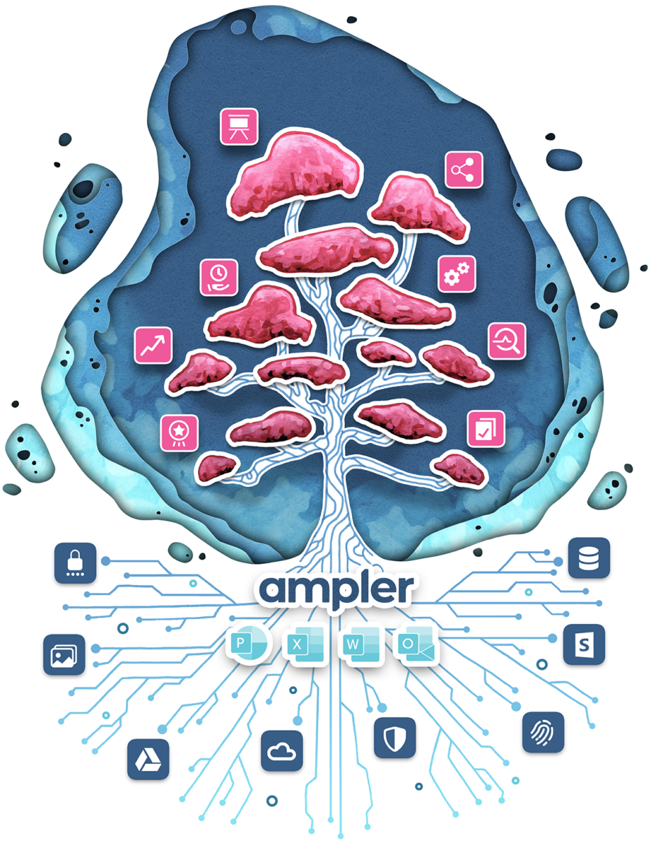
Ampler is not only a Gantt chart software: it’s a comprehensive productivity tool for Microsoft Office. Ampler Charts allows you to create professional-looking charts with a few clicks. The chart options include Mekko, Waterfall, Bar Chart, Area Chart among others.
Additionally, Ampler offers over 150 tools for PowerPoint, including features for aligning, distributing, and formatting text. You can also customize your toolbar to fit your needs, streamlining your workflow.
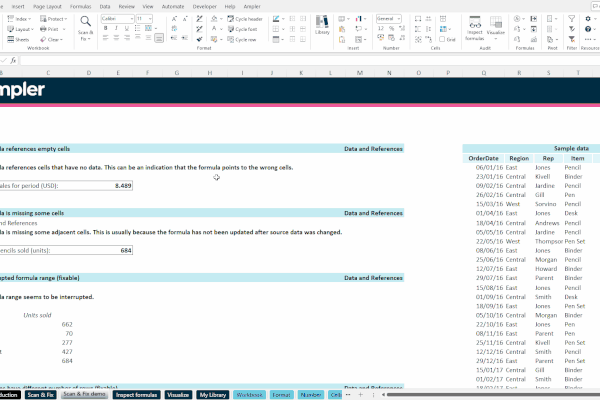
A standout feature it the Scan & Fix Function which scans the entire slide deck for inconsistencies. This includes checking for alignment issues, font discrepancies, incorrect slide numbers, missing footnotes, punctuation errors and other common problems.
The Scan & Fix Function also works in Microsoft Excel, scanning for over 30 of common types of errors. These include issues such as data outside the cell reference range, empty cell references, hardcoded numbers in formula and more. Furthermore, the Inspect Formula Feature provides full transparency by decompressing formulas into individual elements.
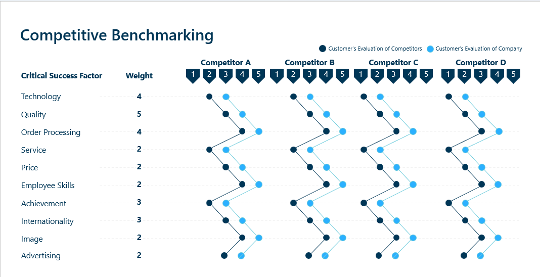
Ampler also contain a content library with over 200 custom-made template slides for consulting presentations. These can be customized to your corporate branding and includes options such as: BCG Growth Framework, McKinsey 7S Model, Competitive Benchmarking, Target Group Analysis etc.
Although it has been many years since Henry Gantt popularized the Gantt chart, it remains the most frequently used project planning tool in the world.
The Gantt chart effectively maps the timeline, tasks, milestones and dependencies, making the project schedule clear for everyone involved. It also efficiently highlights who is responsible for each part of the project. Adaptable to nearly every type of project, expect for agile, iterative or creative ones, it excels at tracking progress like no other tool. Add-ins like Ampler make creating and updating Gantt charts quicker and easier, further enhancing the chart’s popularity.
Ampler offers more than just a Gantt chart tool; as explained it’s a comprehensive productivity add-on for Microsoft Excel, PowerPoint and Word. With Ampler Charts it’s never been easier to create amazing looking charts from a stacked bar chart to a mekko or waterfall chart among others. As with Gantt charts these can be created with a few clicks.
For more tips and information about features, click the link below.
PowerPoint tutorials Archives – Next generation tools for Microsoft Office
for related resources to amplify your presentations:
Tips, tricks, and best practices – Ampler Articles
Already convinced that Ampler can help you – Download a free trial of Ampler and Ampler Charts below:
Try Ampler for free – Next generation tools for Microsoft Office