McKinsey slide decks are among the world’s best, so if you are looking for inspiration on how you can take your PowerPoint presentation to the next level, then here you have it! We have gathered a lot of McKinsey presentations that are available online for free. So, if you are looking for slide designs that use phenomenal visuals in the form of charts, tables and graphs, then these McKinsey presentations are what you seek!
One of the Worlds Top Consulting Firms
First, a little background information, McKinsey is an interesting company indeed. Sometimes referred to as McKinsey & Company, the consulting firm is one of the Big Three management consulting firms along with Boston Consulting Group and Bain.
McKinsey & Company was founded in 1926 by James O. McKinsey. One of the oldest and the largest management consultancy in the world it has become renowned around the world. With a notoriously competitive hiring process and being one of the most selective employers in the world, McKinsey have created a workforce with field expertise, incredible business acumen and exceptional analytical skills. Their focus area is on corporate strategy and organizational structure.
Arguably, McKinsey is the most famous of the three big consulting firms as it significantly shaped the industry by developing a distinct approach to problem-solving. They have worked with some of the most famous companies in the world which include two thirds of the Fortune 1000. Examples include Meta, Google, ExxonMobil, among others. Furthermore, they also have their own business magazine: The McKinsey Quarterly.
Why are McKinsey Slide Decks Often Imitated?
A consulting presentation is often imitated by others! The reason is their ability to convey complex information in a convincing manner. The slide deck often has an executive summary, an actionable plan, bullet points among other common slides helping audience/client to dissect the information. However, creating a slide deck like the ones you see in a McKinsey presentation isn’t easy.
It takes consistent effort and skill. Presenting a live presentation for a potential client requires a clear structure in your slide deck with thought-provoking graphs, charts, and insights. So, although you aren’t working in consulting, creating a full deck consulting presentation like McKinsey is a great skill and investment to learn how to present value to your client.
Don’t expect to master creating an incredible McKinsey presentation right away; like any skill, consistent work and determination are needed.
How to Make Compelling Slide Decks
McKinsey Consultants are incredible at making a presentation. Few have mastered creating slides better than these professionals.
McKinsey slide decks have a consistent design and visual appeal, which is hard to rival. Presenting data, especially big data, in a concise manner is difficult. The fine line between making too simple slides and too complex slides is hard even for experienced creators.
A McKinsey presentation can do this and then some. The slide deck has an overall phenomenal presentation style, and their data analysis is top-notch. To achieve a McKinsey-level presentation requires a clear layout, a complete storyline structure, and acute attention on conveying difficult information to an audience or client in a compelling, concise and understandable manner.
One key feature of a consultant slide deck is an action title. An action title basically sums up the key takeaway information of the slide. The rest of slide should provide more context to the overall point of the information presented, but the action title must convey the overall meaning.
The clear storyline thought out, can be summarized in key points in a summary, as seen here:
Down below, we have gathered numerous free McKinsey presentation decks, an amazing resource on how to make your own incredible presentation like McKinsey’s.
Collection of McKinsey Slide Decks
Some of the slides collected are older, while others are more recent years. Some of them can be downloaded; others are only available online for viewing. Nevertheless, they are still an incredible source for inspiration on for example how to present a strategy to an audience or clients.
You can find similar lists of slides for Boston Consulting Group here and Bain here.
McKinsey Industry Reports PowerPoint Presentations:
These McKinsey slides highlight trends and challenges in specific industries. Examples include the Automotive industry post-Covid and artificial intelligence in the healthcare industry
Gathered here are some market overviews and global trends, for example a research report on technology trends and their implications for corporate strategy.
The following presentations are created by McKinsey’s Business and Economics Research Arm. This research arm aims to help leaders in the commercial, public, and social sectors develop a deeper understanding of trends in the global economy through technology, economics and management.
McKinsey has a lot of articles called “Insights” on their homepage. Here, every topic under the sun is discussed with thoughtful, valuable, detailed information, graphs, bullet points, charts, and more.
Some of these articles can inspire your presentation, as some have a short McKinsey slide deck or pictures of slides. Most of the articles feature charts, which are an incredible source for presenting your own analysis and data effectively to an audience.
We have provided some articles below that include great visuals and charts from a McKinsey presentation. For more examples, visit McKinsey: McKinsey Insights
In addition to the free consultant slide decks from McKinsey available online, Ampler has its own free library useful for professionals working in consulting, finance, marketing etc. With Ampler you can easily incorporate the library and slide deck into your own corporate branding.
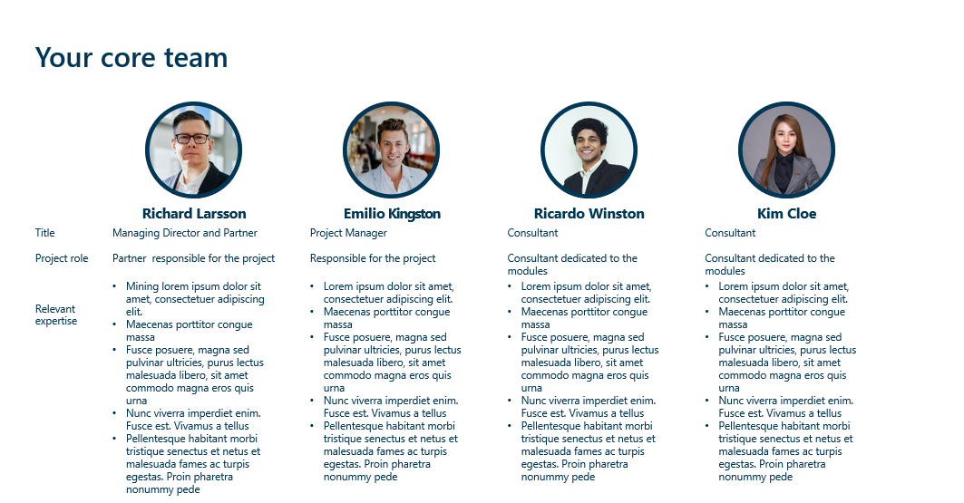
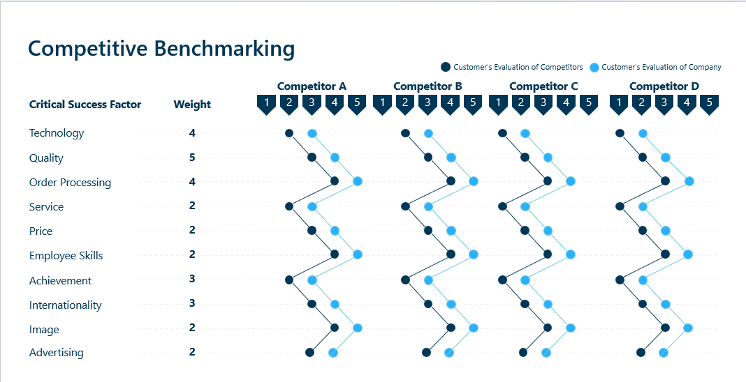
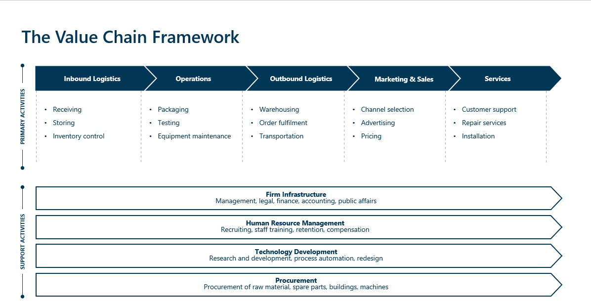
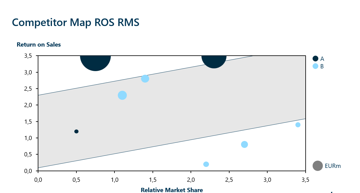
In total Ampler contains over 200 custom-made template slides. Some examples include value chain framework, competitive benchmarking etc.
The library also contains 2,000+ shapes for your presentation, including:
Maps
Flags
Structures
….And much more
And over 6.000+ icons for your presentation:
Outlined
Filled
Two Tones
Some of the icons are shown below:
McKinsey Specific Slides for your Presentation in Ampler
Ampler has some McKinsey-specific templates often used in consulting practices for your presentation slide deck which includes: McKinsey’s Three Horizons of Growth, McKinsey’s 7 Degrees of Strategic Freedom and McKinsey’s 7s Model. If you are unfamiliar with what these are, then we have provided a short rundown of each.
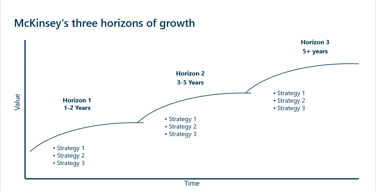
McKinsey – Three Horizons of Growth
McKinsey’s Three Horizons of Growth is a strategic framework used in consulting that helps organizations categorize their initiatives into three distinct separate horizons
The first horizon focuses on extending and defending the core business. Here, activities focus on generating immediate returns, and efforts aim to optimize operations and defend the business against competitors
The second horizon involves emerging businesses opportunities. It focuses on identifying new growth areas that are adjacent to the core business. Investments involve scaling up promising projects and enter new markets .
The third and last horizon is about creating long-term value. Here the focus is long-term innovation and involves exploring new ideas and potentially a new industry that could fundamentally transform the company. The aim is securing the firms competitive edge long-term.
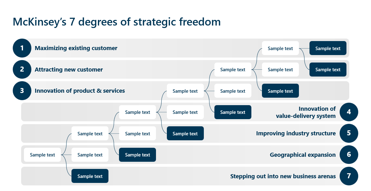
McKinsey – 7 Degrees of Strategic Freedom
The 7 Degrees of Strategic Freedom is a framework developed by McKinsey that helps organizations assess their strategic options and the extent to which they can differentiate themselves in the market. Each degree represent a different level: from incremental to radical innovation.
Maximizing Existing Customer: Enhance value for current customers by improving customer service, upselling, cross-sell products etc.
Attracting New Customer: Expand the customer base by launch targeted campaigns, diversifying product offerings, etc.
Innovation of Product & Services: Develop new or significantly improve products and services through investment in R&D, staying attuned to trends, etc.
Innovation of Value-Delivery System: Transform the way services and products are delivered to customers by optimizing the supply chain, adopting digital transformation, exploring new distribution channels etc.
Improving Industry Structure: Shape the completive dynamics of the industry by advocating regulatory actions, mergers or acquisitions, etc.
Geographical Expansion: Enter new markets by establishing operations in new countries, tailoring products to local preferences, etc.
Stepping Out Into New Business Arenas: Diversify the company’s portfolio by venturing into new industries, exploring new business models, leveraging core competencies, etc.
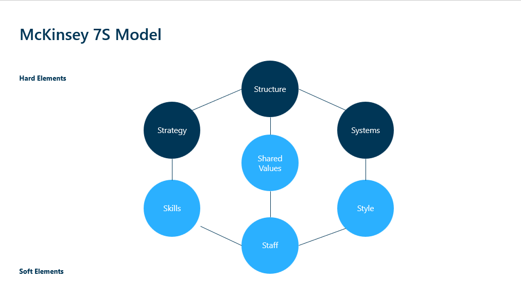
McKinsey – The 7S Model
The 7S model by McKinsey is a consulting management framework that helps organizations align their internal elements to achieve strategic goals. It emphasizes the interconnectedness of seven key components categorized into hard and soft elements. The model can be used to improve organizational effectiveness and align strategies.
Hard Elements
Strategy: The plan to build a competitive advantage, for example, long-term vision, market position, and resource allocation, etc.
Structure: The organizational structure focuses on communication flows, hierarchy, etc.
Systems: The daily procedures focus on business processes, workflow, etc.
Soft Elements
Shared Values: The core values including company’s mission, vision, culture, and core principles
Skills: The actual skills and competencies of the employees
Staff: Employment retention, motivation, performance, etc.
Style: The leadership style including approach, management style, communication pattern, etc.
Amplify Your Presentation Slides
Ampler offers more than just a content library; its a full Office productivity tool. With Ampler, it’s easy to align objects, texts, etc. Distribute and arrange shapes evenly with defined space, create agendas, manage slides, format a slide or the whole presentation at once, insert dynamic infographics, and much more.
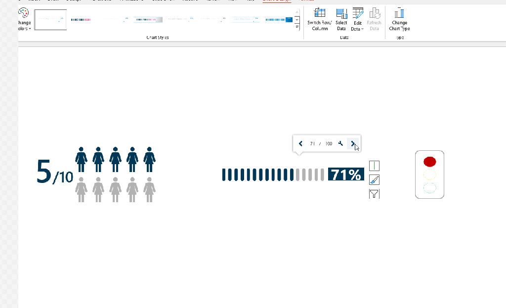
Some of the dynamic infographics is shown below:
All this helps avoid a lot of time spent making the presentation itself ready for your client. Instead, time can be spend on making a convincing and engaging analysis on how to tackle the challenges of the client. Consultants will save multiple hours a week with this tool.
The video below is an introduction to the amazing benefits of Ampler for PowerPoint
Ampler Charts is a Great Tool for Consulting Presentations
Ampler Charts has extraordinary capabilities that easily can create amazing charts with a few clicks! You can also create a link to your data from an Excel table, which makes the chart instantaneously shift to fit the data.
With these charts, quickly change the layout and visuals of the chart to fit your company and branding. You can even change the charts to other charts by right-clicking and selecting the desired chart. Then the charts will shift to the new type at once, saving a lot of time.
As mentioned, if you already have data in an Excel table, click on “Establish Excel link”, highlight the tables and then the charts will change to fit the data.
Ampler in Excel & Word
Outside of PowerPoint, Ampler also provides features for Excel and Word.
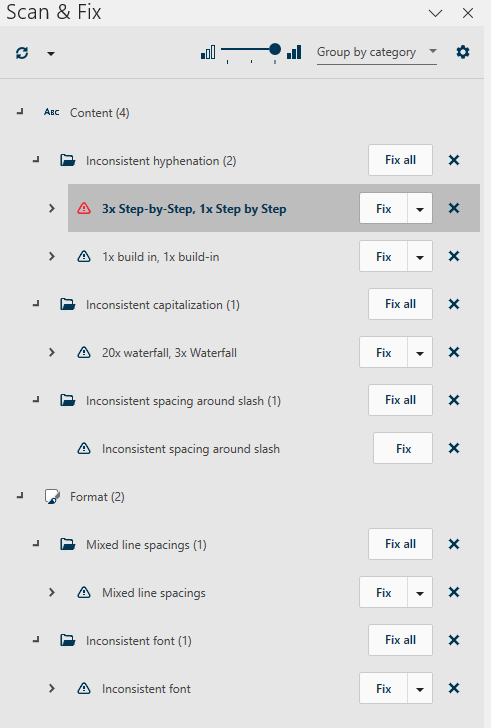
In Excel, the Scan & Fix function scans models for the most common types of errors, including data outside cell reference range, empty cell references, hardcoded numbers in formulas, and others.
Further, color-coded visuals and layout help show inconsistencies in the formulas:
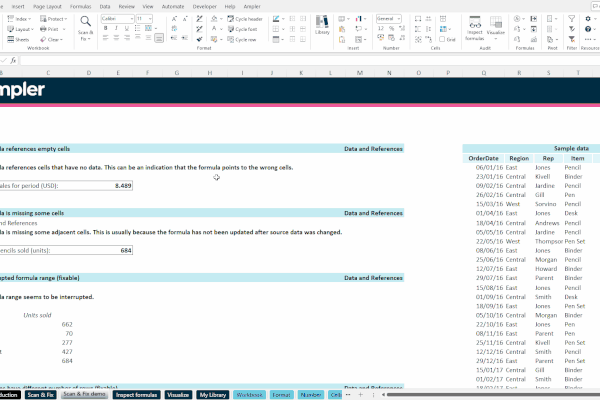
In Word, you have access to the same content library, and Ampler Charts can easily be inserted and formatted as well. The Scan & Fix-Function also applies making work progress way faster. Here’s is an example of an article scanned for mistakes. The same interface is used in PowerPoint.
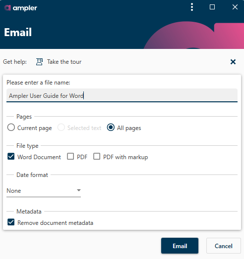
You can also E-mail the entire presentation or some of it directly in Word and PowerPoint with Ampler.
In summary, Ampler is a great tool for people who work with consulting as it amplifies work productivity and saves valuable time. Three’s no need to spend hours aligning your presentation. For a free trial of Ampler and Ampler Charts, click the link below:
This website uses cookies in order to improve the user experience. When you continue to use this site, you accept the use of cookies. Read more about our cookie policy here.